Inputs and Outputs

Author

Peter M. Crosta

Published

May 9, 2025

Inputs and Outputs

This document contains comparative data on educational inputs and outcomes for Fair Haven and peer districts. In an effort to learn more about education in Fair Haven and how it compares to peer districts, I started building a data set and creating lots of graphs, many of which are reproduced on this page. The focus is on educational inputs and outcomes that live in data sets available to the public. This is to say that there are, of course, a number of inputs and outcomes that are not captured here, and thus this is a very incomplete picture of any educational process. What we can measure or what available measurements we have are not always the measurements that we might want or measurements at the right granularity. But we press on. Inputs include items such as teacher characteristics, student characteristics, and expenditures. Outcomes here are primarily oriented around standardized test scores.

Rather than commenting on every graph on this page, I have compiled a list of “things I have learned” combing through the data.

Expenditures

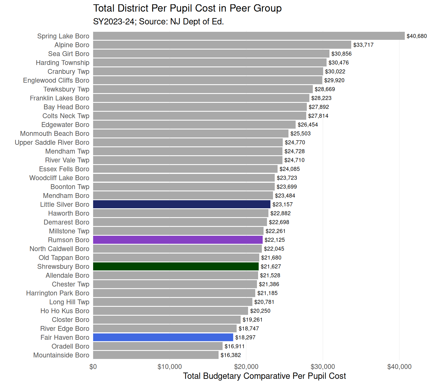
  • Compared to peers, Fair Haven had a relatively low total per-pupil expenditure ni 2023-24 (Figure 1). At face value, it is not obvious as to whether this is a positive or negative, something to champion or a concern. Fair Haven spent about $5,000 less per student than Little Silver, and one could easily imagine what an extra $5k could purchase.
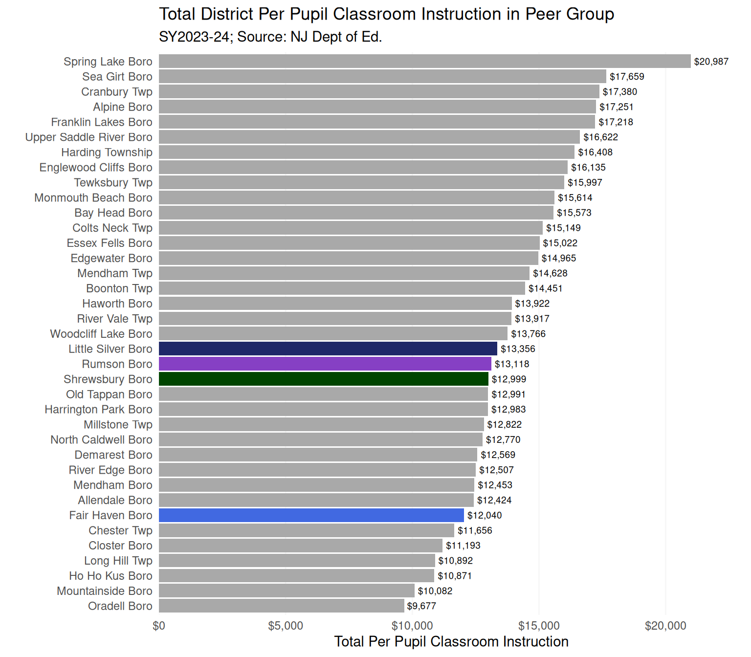
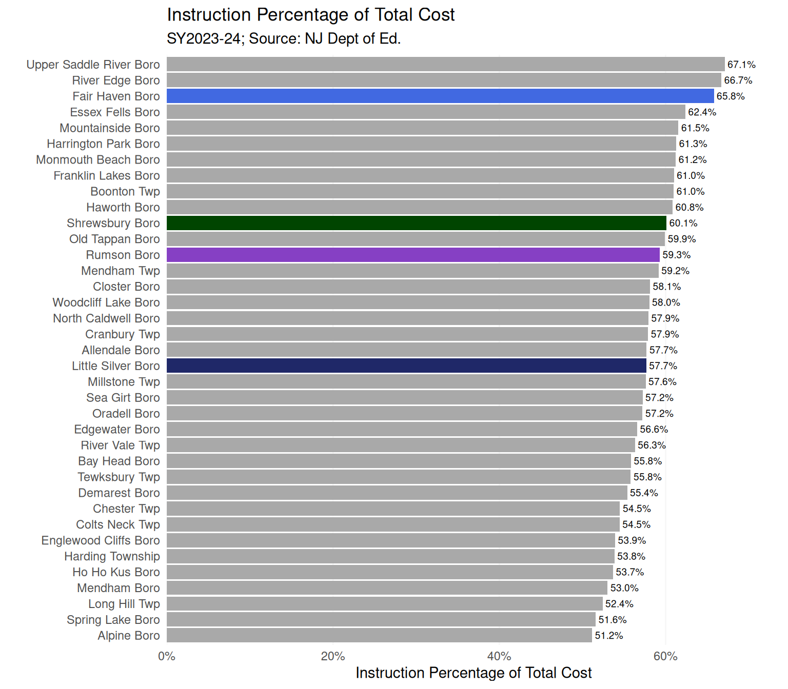
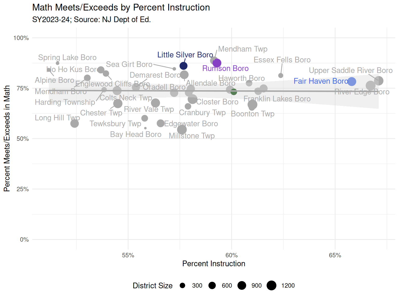
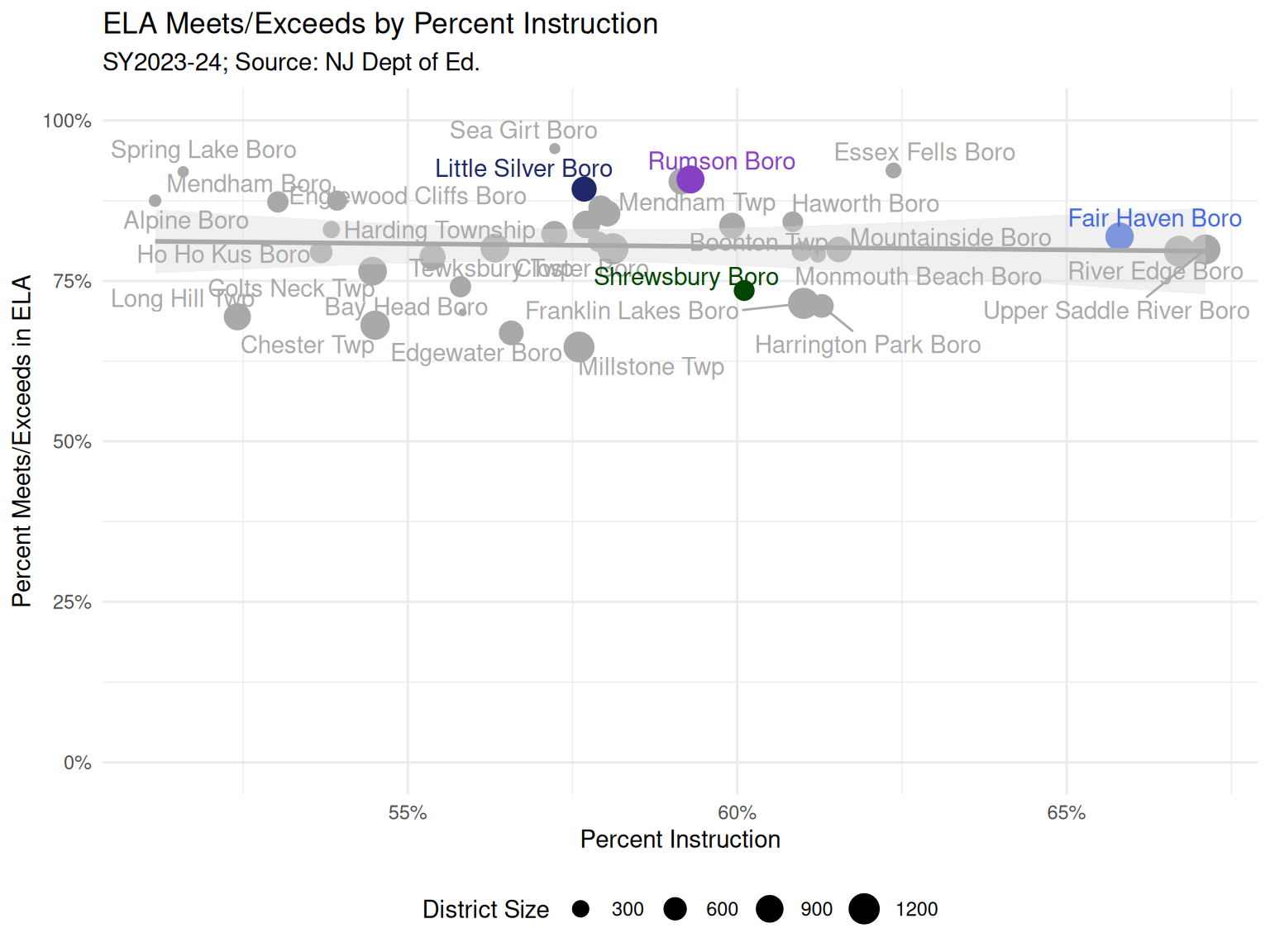
  • Total expenditure includes a number of costs that may not be so tightly associated with educational products, and so I also look at per-pupil expenditures on instruction (Figure 2). Here we see Fair Haven again had a relatively lower per-pupil expenditure, though the delta between Fair Haven and our geographic neighbors was only about $1,000. Related, Fair Haven had nearly the highest percentage of expenditures going to instruction. (Figure 4)
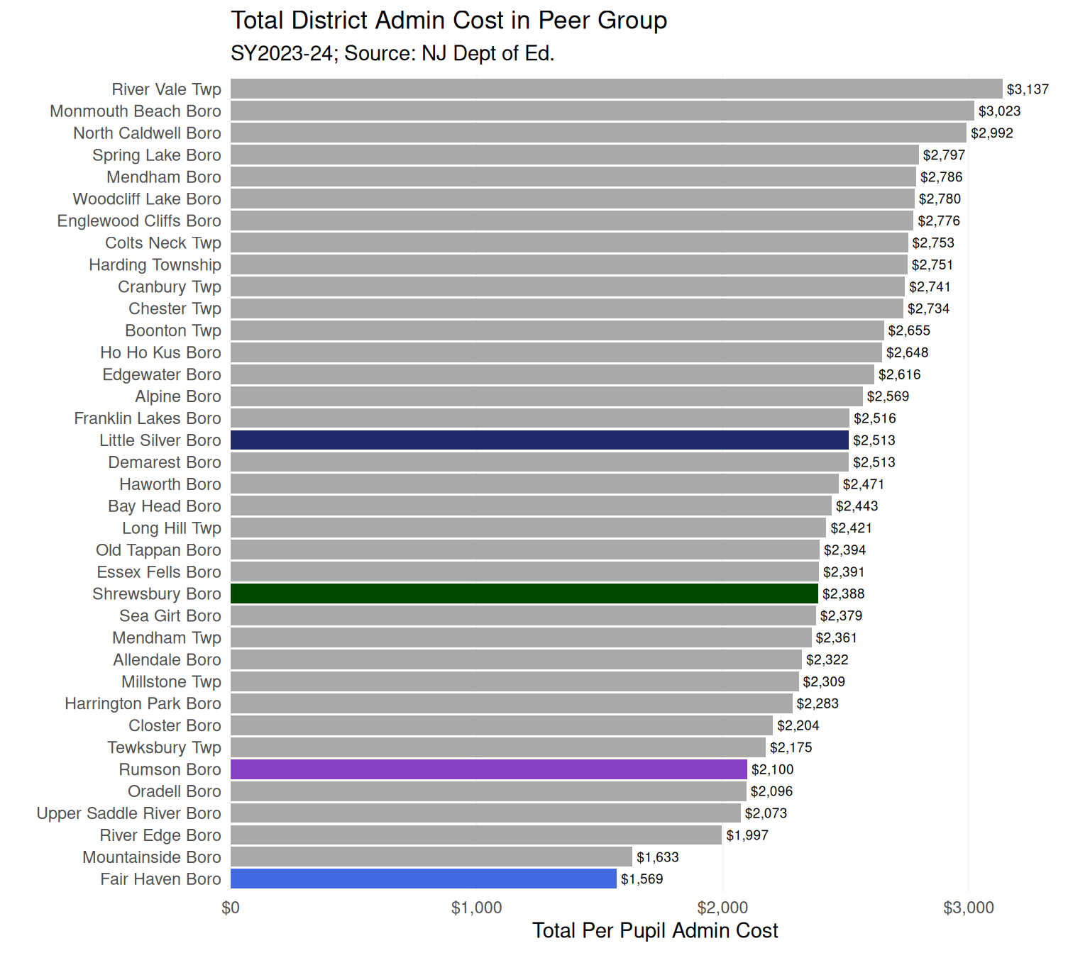
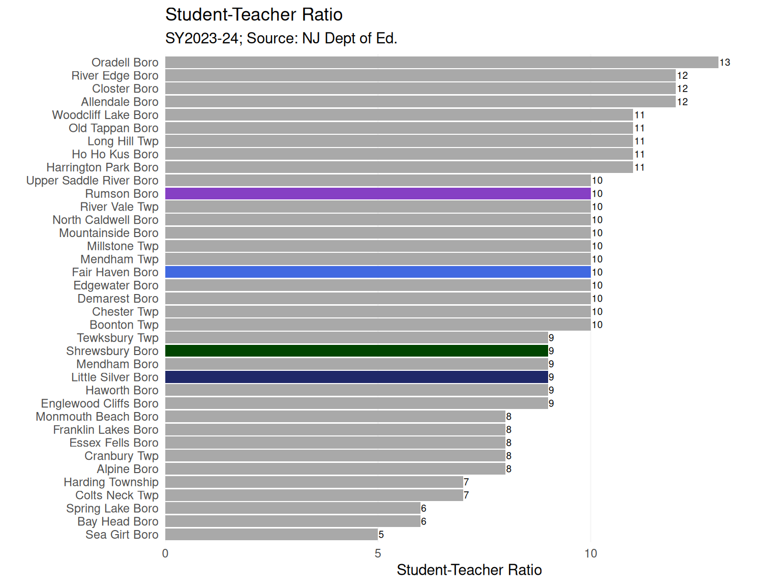
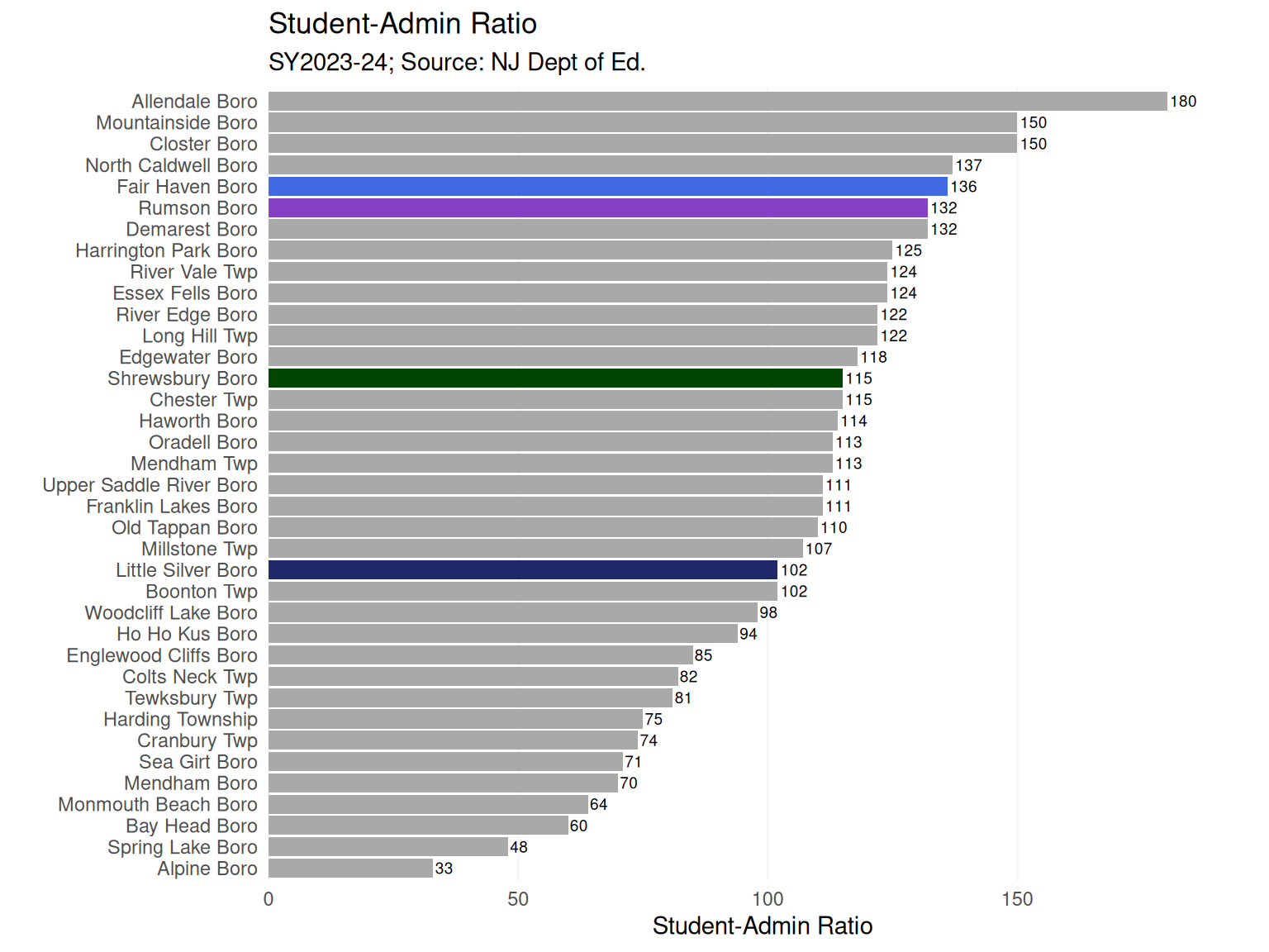
  • Notably, Fair Haven had the lowest administrative cost per student out of the entire peer set (Figure 3). Related, Fair Haven had among the highest student-admin ratios, or a high number of students per administrator (Figure 6).

Teachers, absences, special education

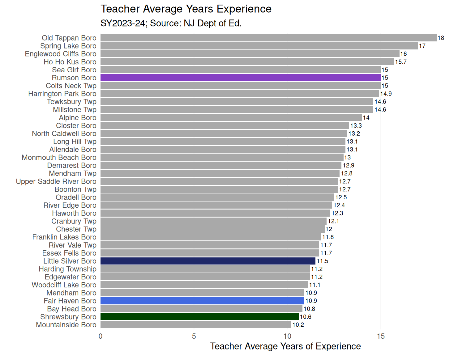
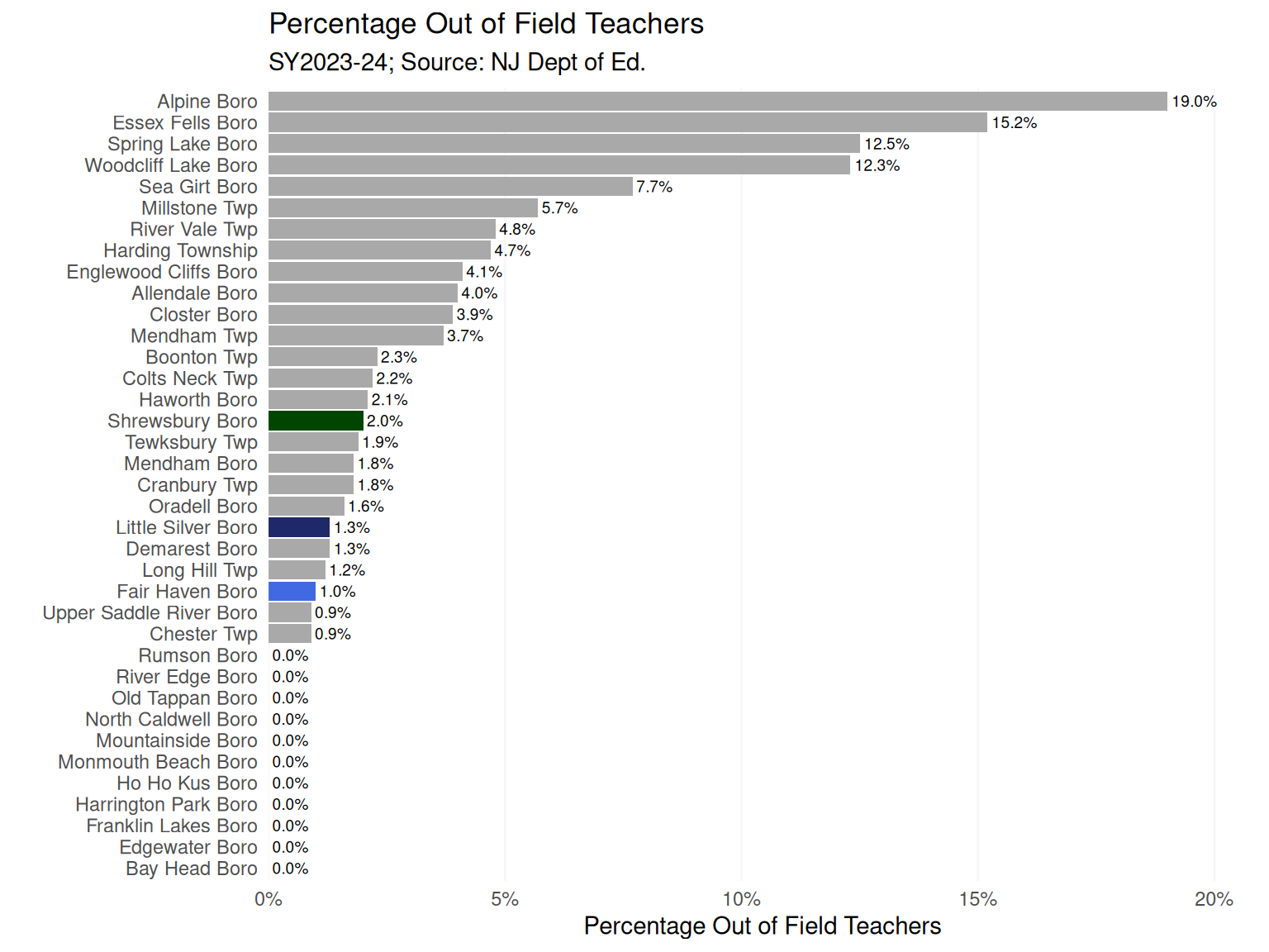
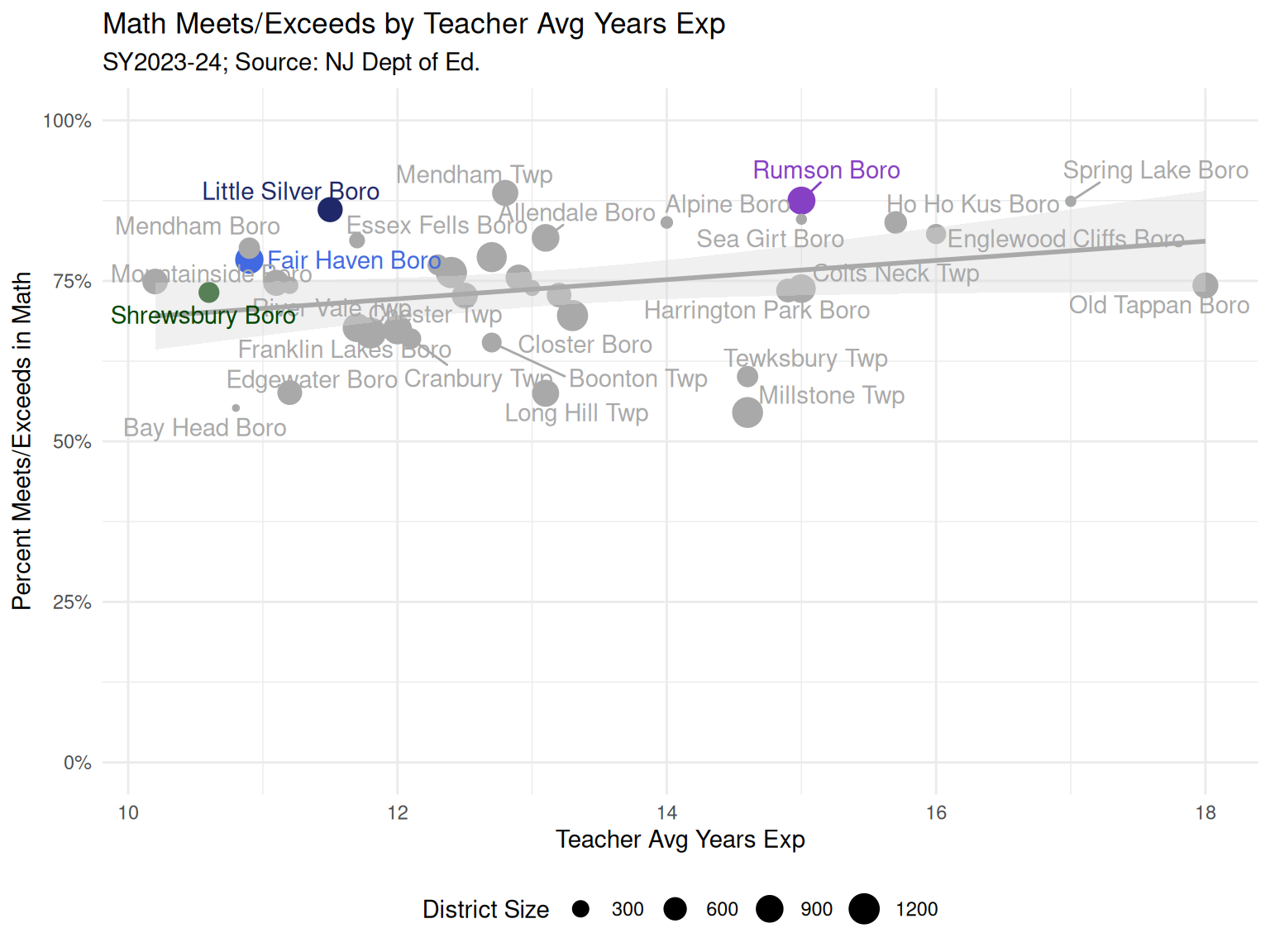
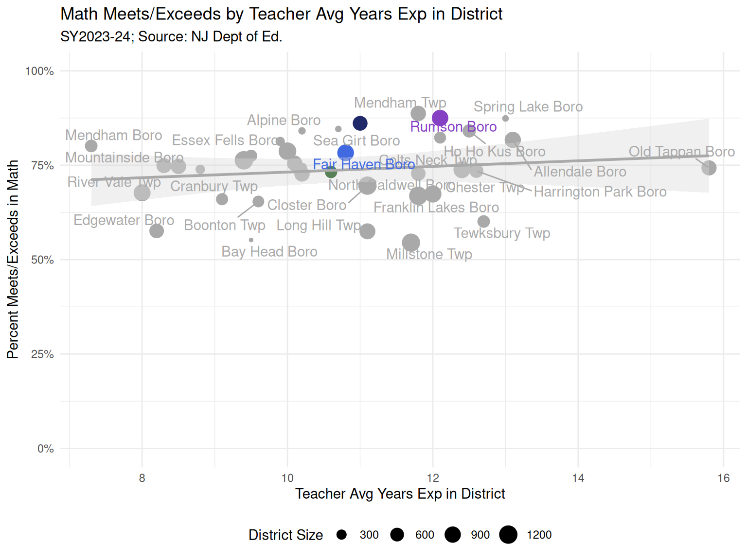
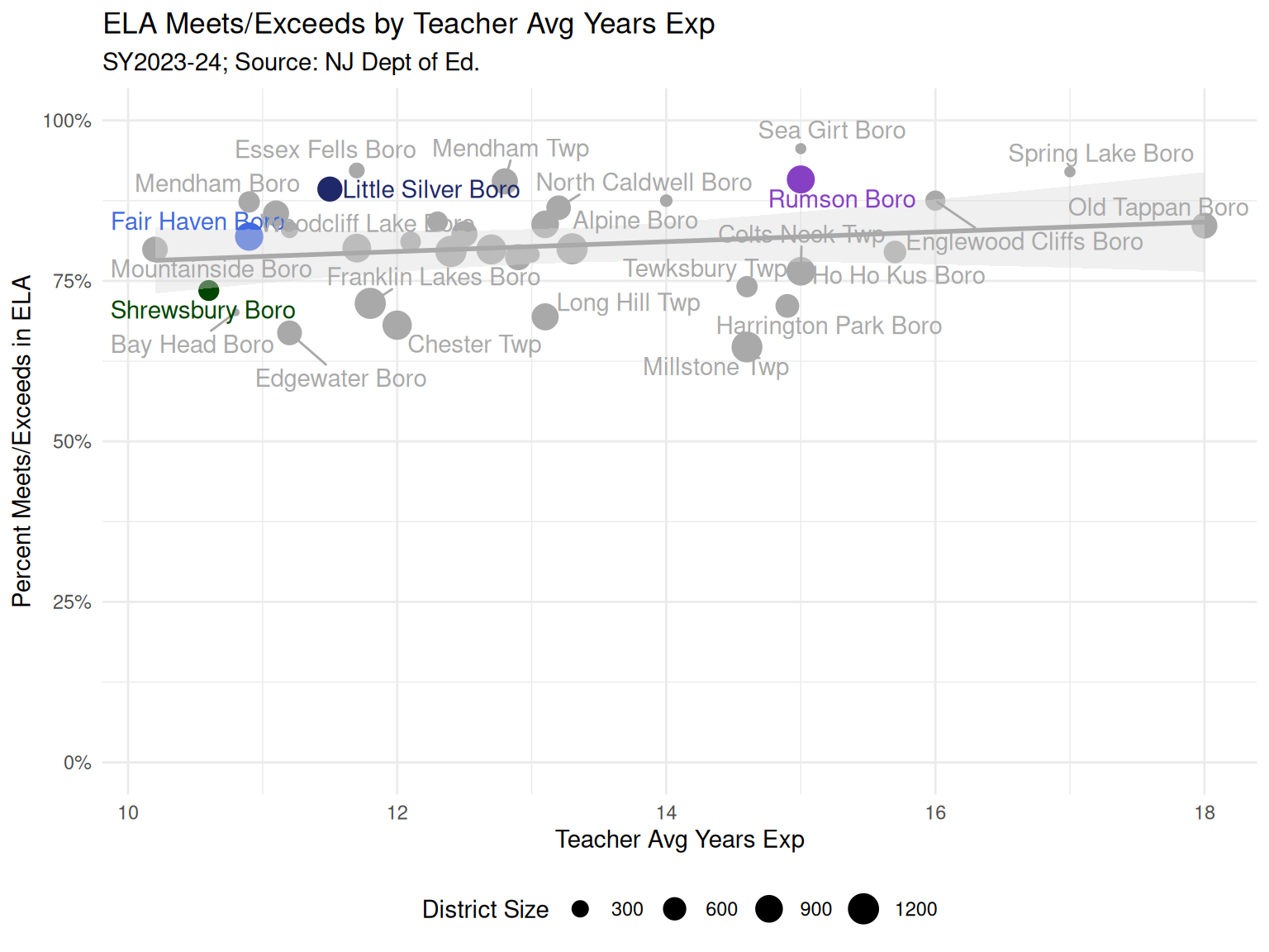
  • Looking at teachers, Fair Haven had one of the youngest teacher work forces in terms of years of experience (Figure 7).
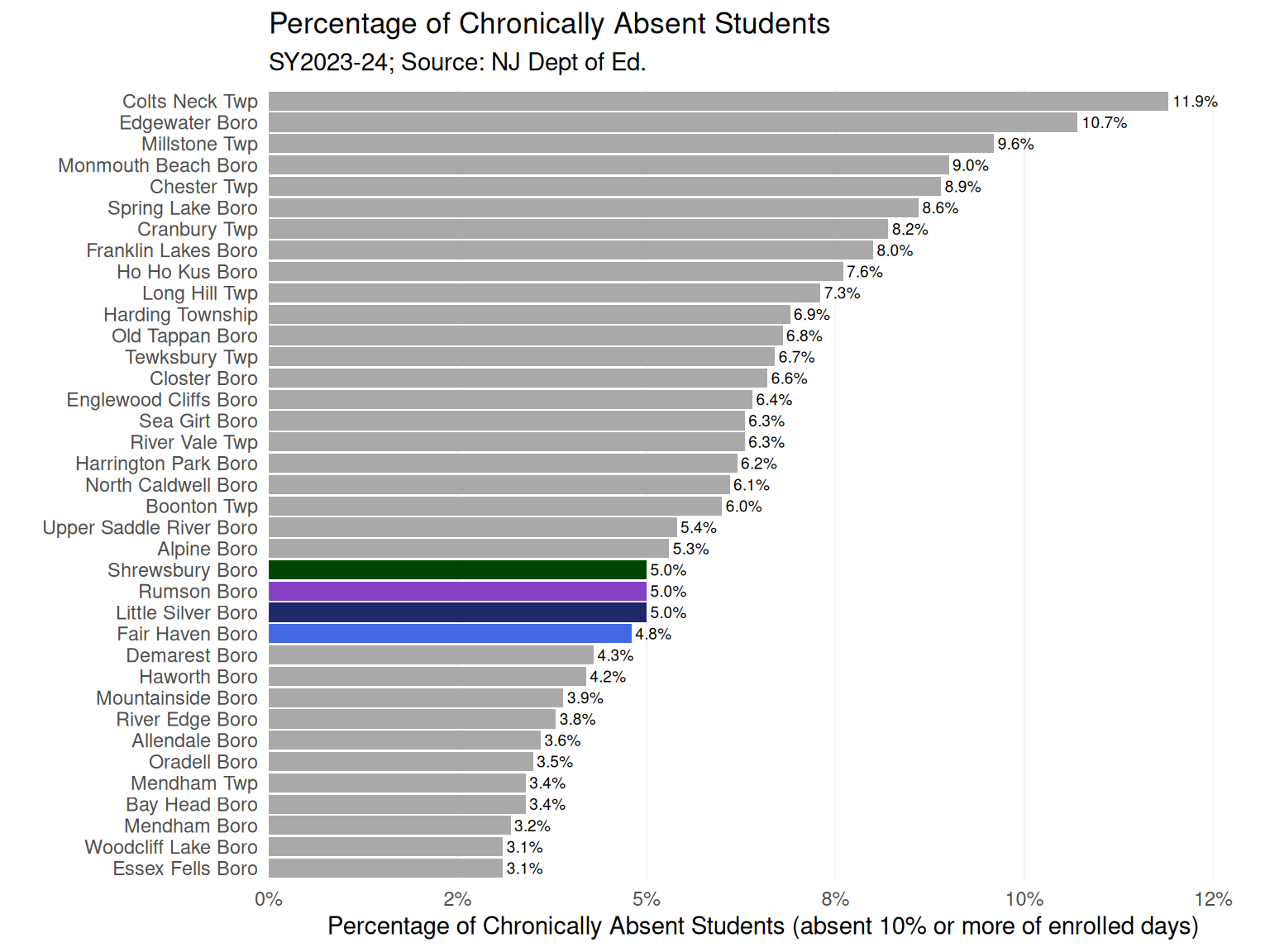
  • Historically, Fair Haven has had challenges with chronic absences, but in the 2023-24 school year, the chronic absence percentage was nearly the same as our geographic neighbors, 4.8%. (Figure 11)
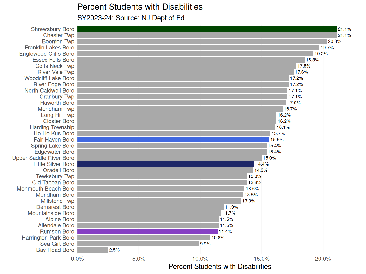
  • Also historically, or at least anecdotally, Fair Haven has had a relatively large proportion of students classified as “with disabilities”, which broadly includes any students with IEPs (Individualized Education Plans). As seen in (Figure 12), Fair Haven is about in the middle of the peer group with 15.6% of students receiving special education.

Math outcomes

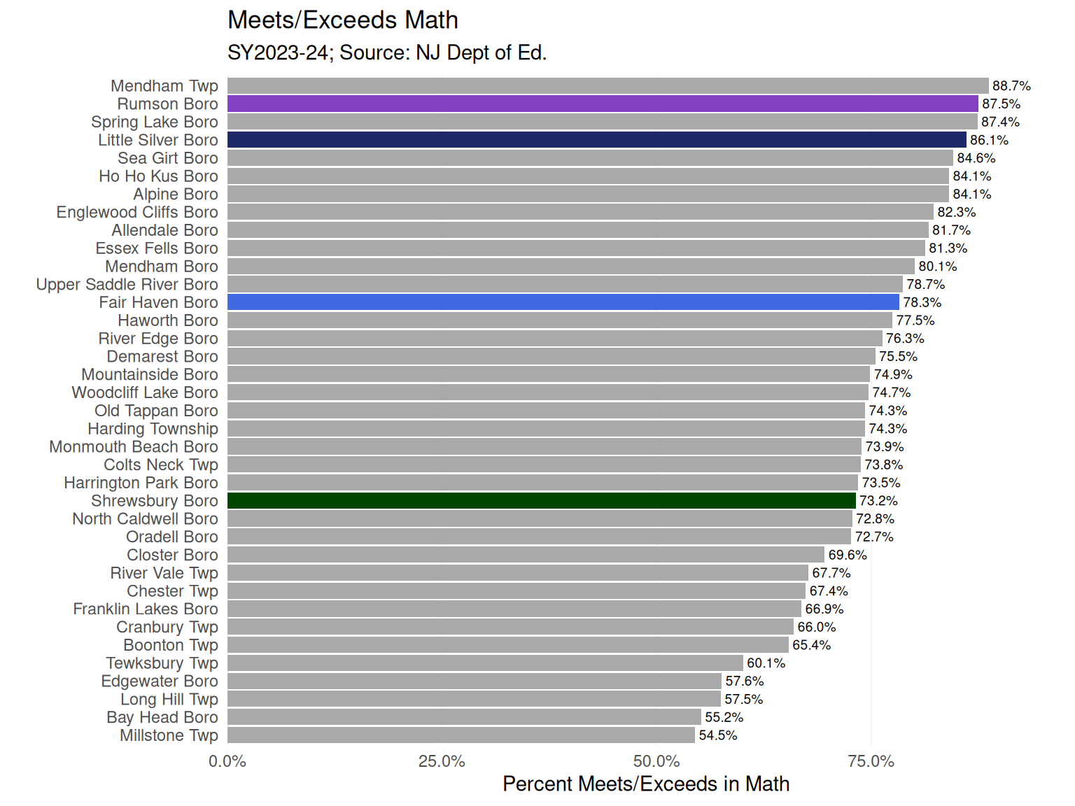
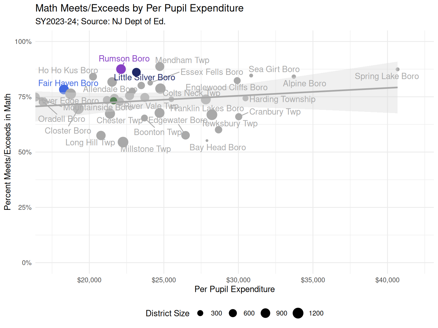
  • Most districts in the peer group had at least 70% of students meeting or exceeding expectations in Math according to state standardized tests in grades 3-8, with Fair Haven in the middle 3rd of the pack at 78.3% (Figure 13). Rumson and Little Silver had over 86% of students meet or exceed expectations in Math (these are among the highest in the state).
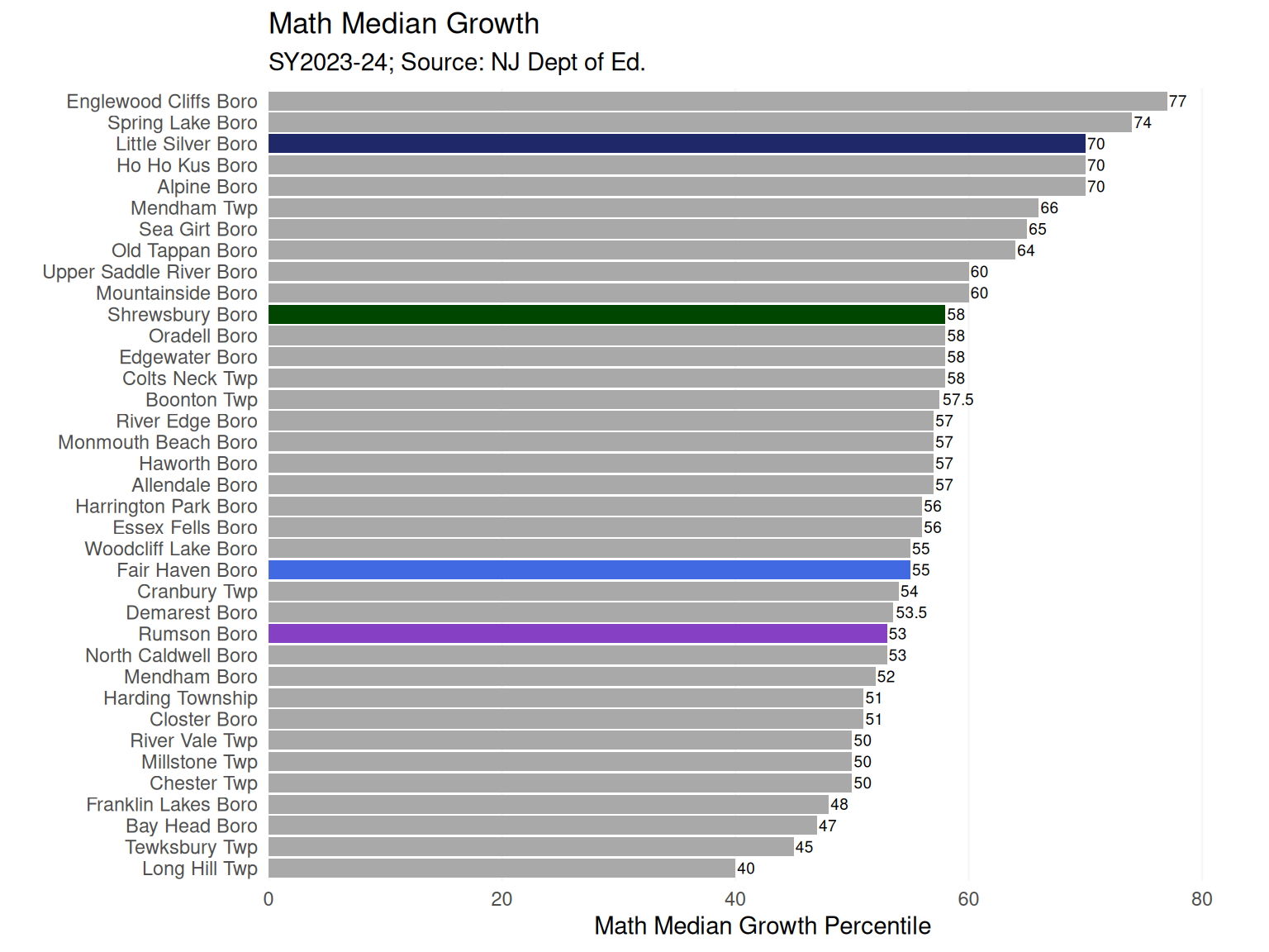
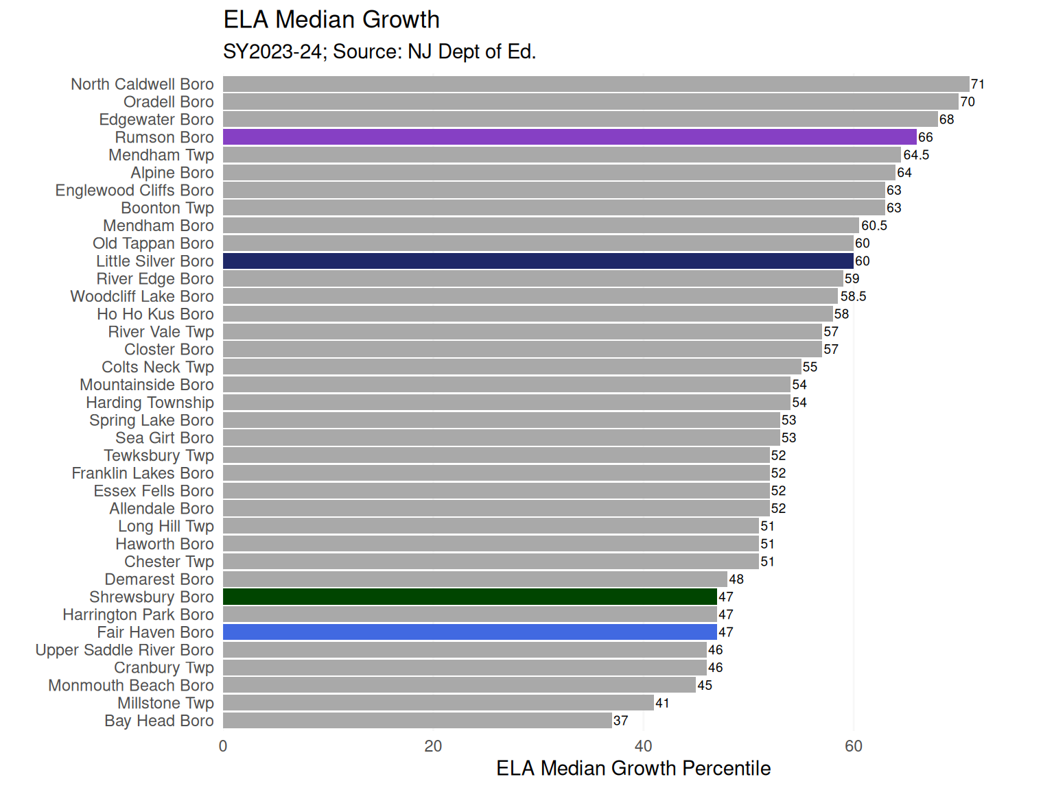
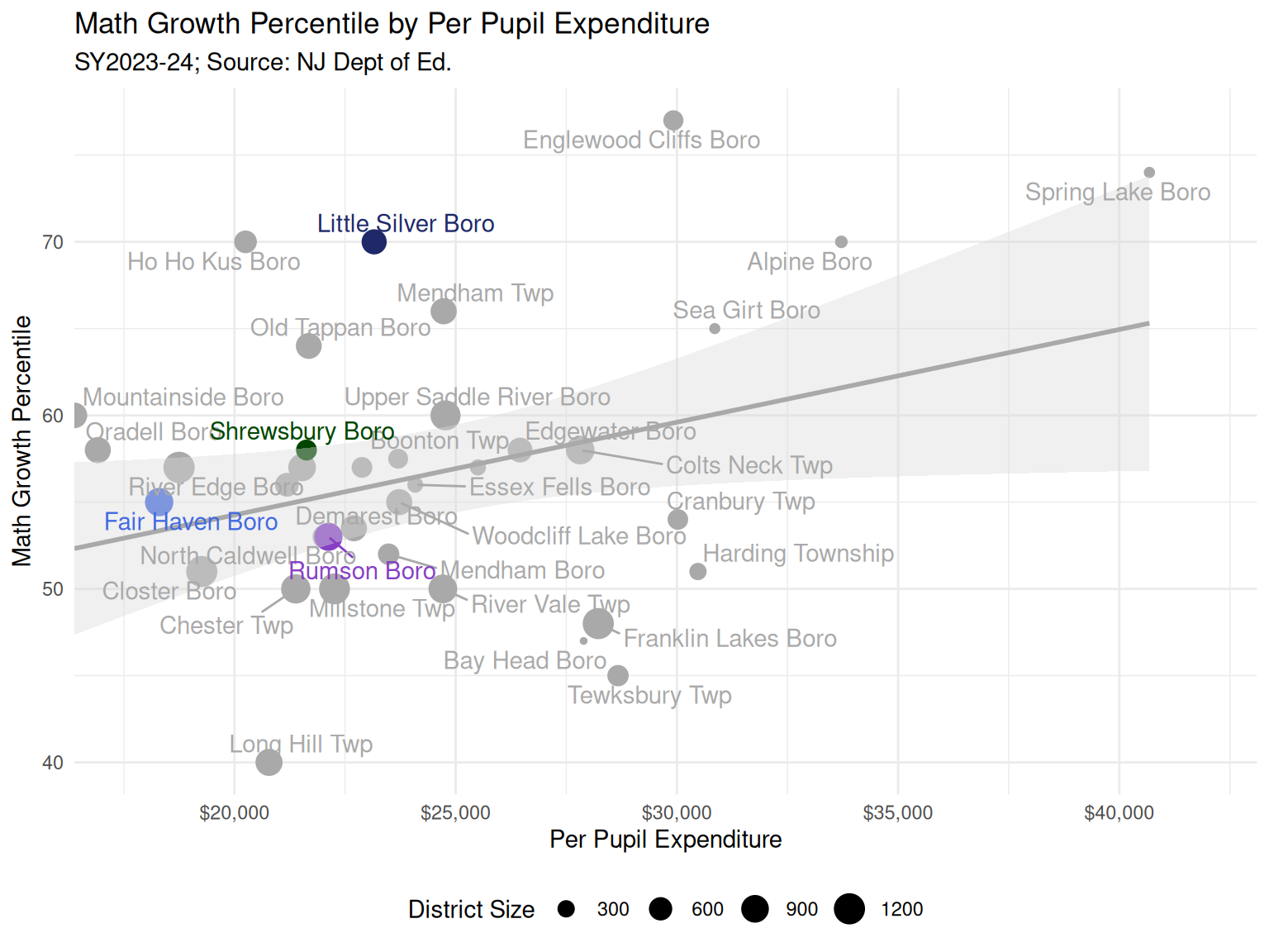
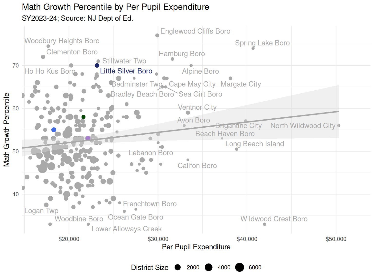
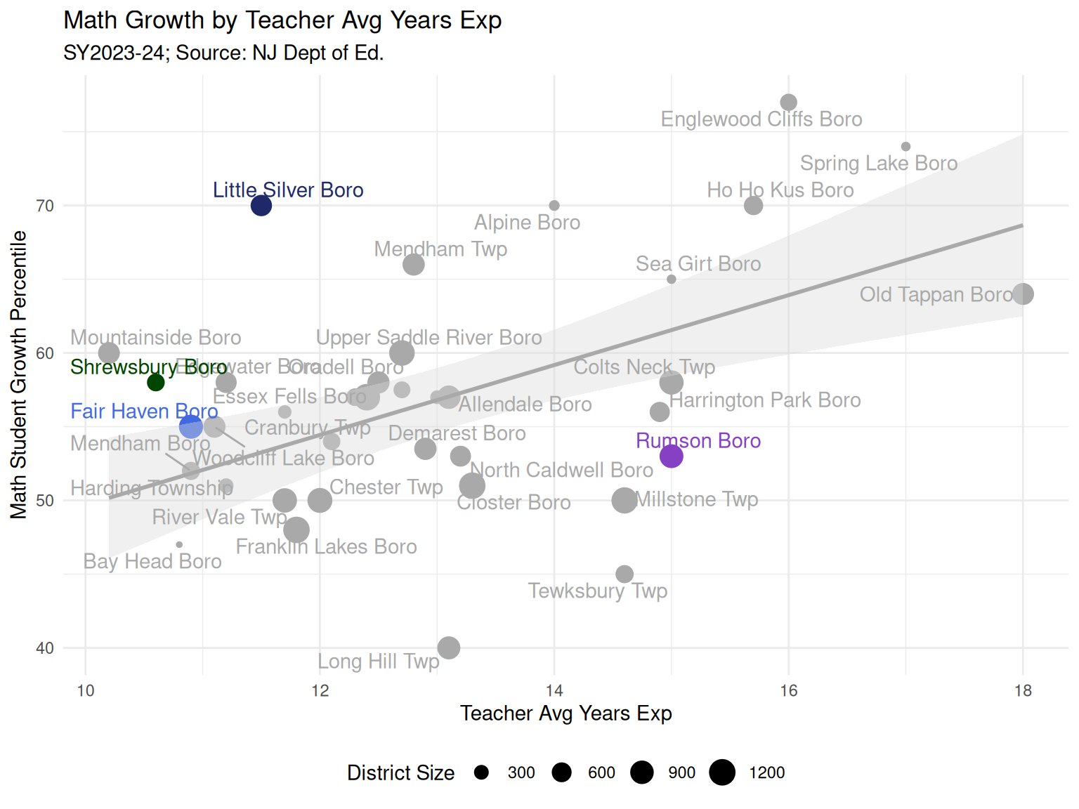
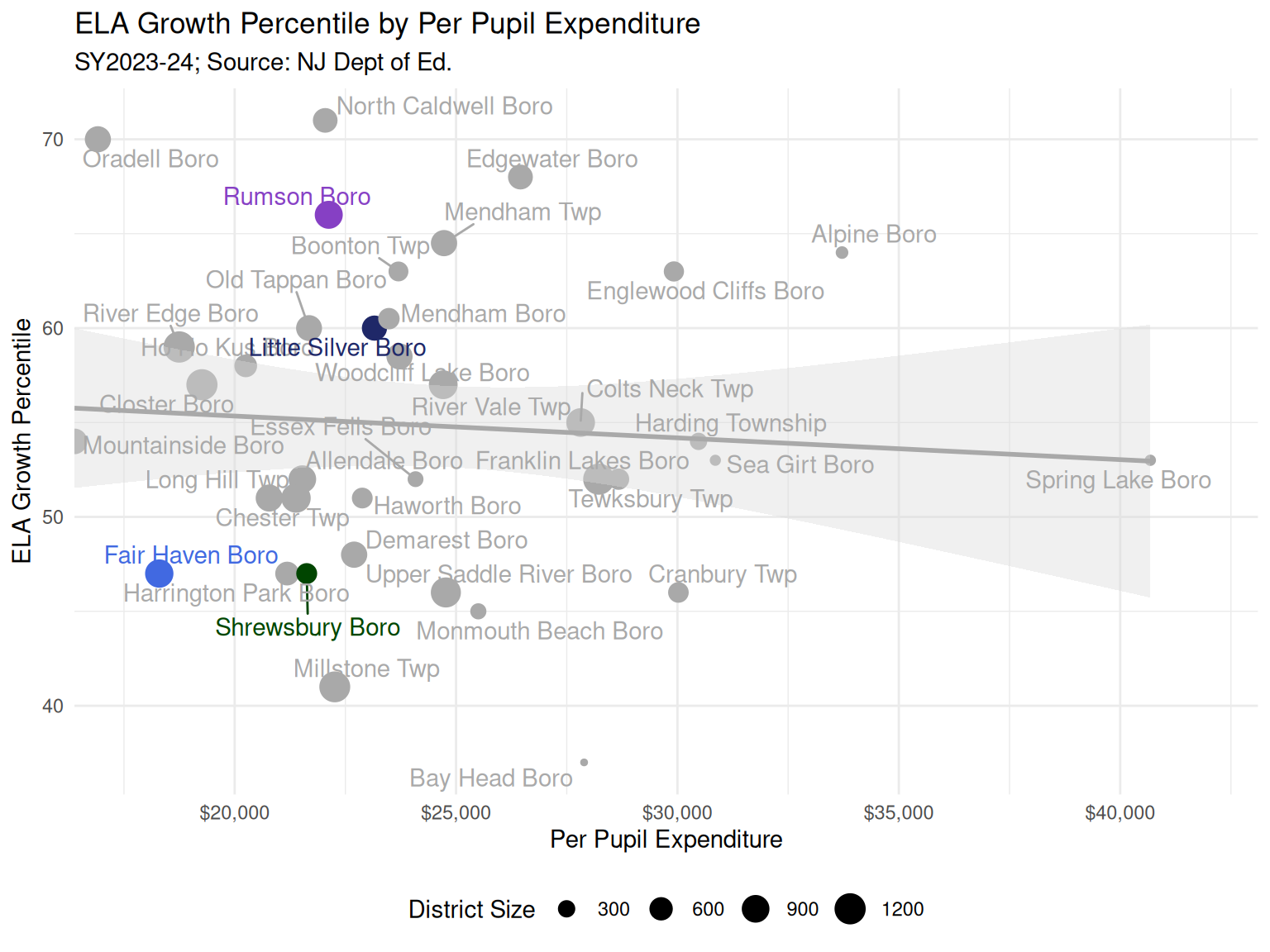
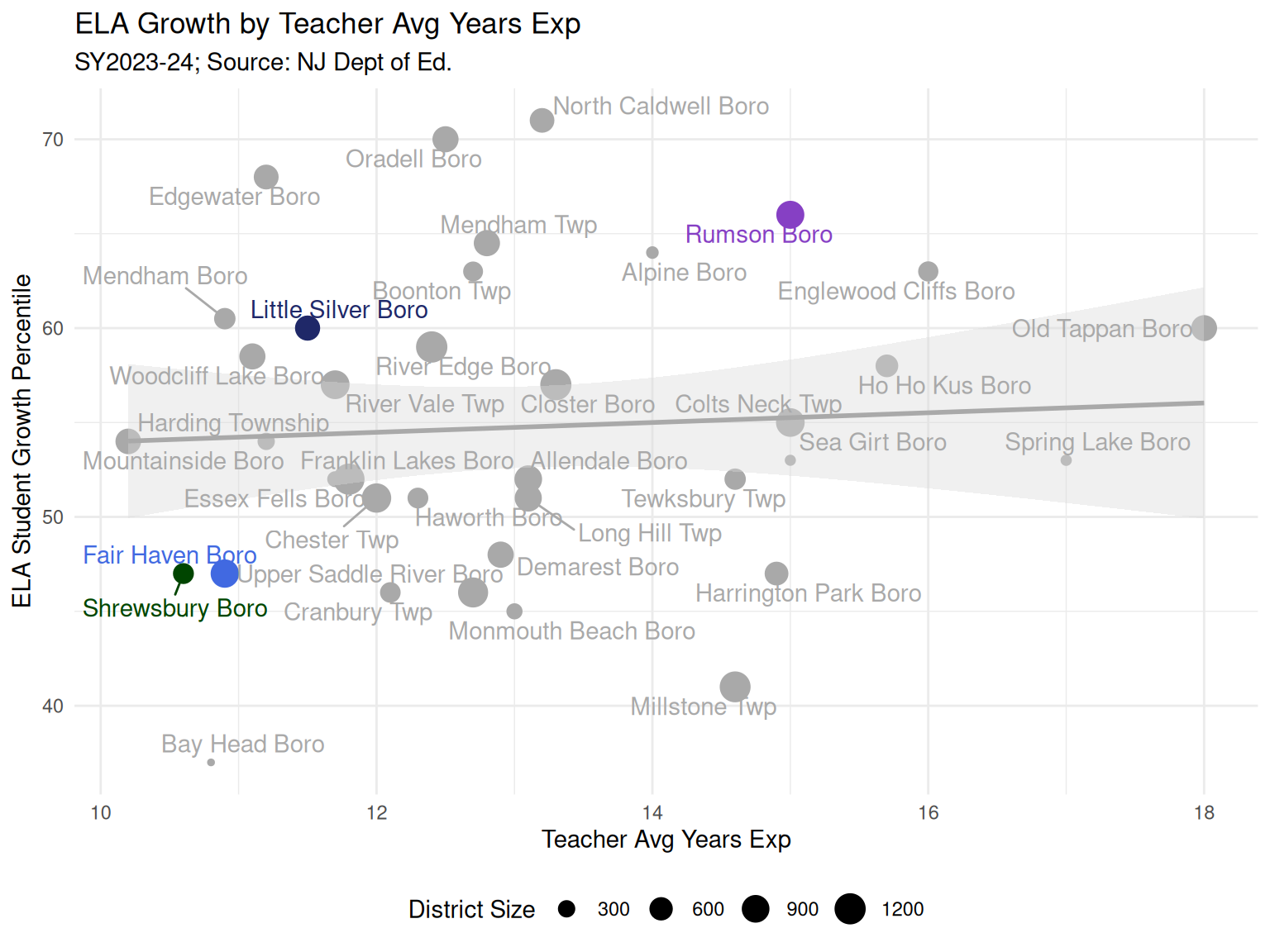
  • In Math, Fair Haven had a median student growth percentile (SGP) of 55. SGP is a hard-to-interpret measure of academic progress from one year to the next, and 55 is considered typical. Rumson’s SGP was 53 and Little Silver’s was 70. (Figure 15)
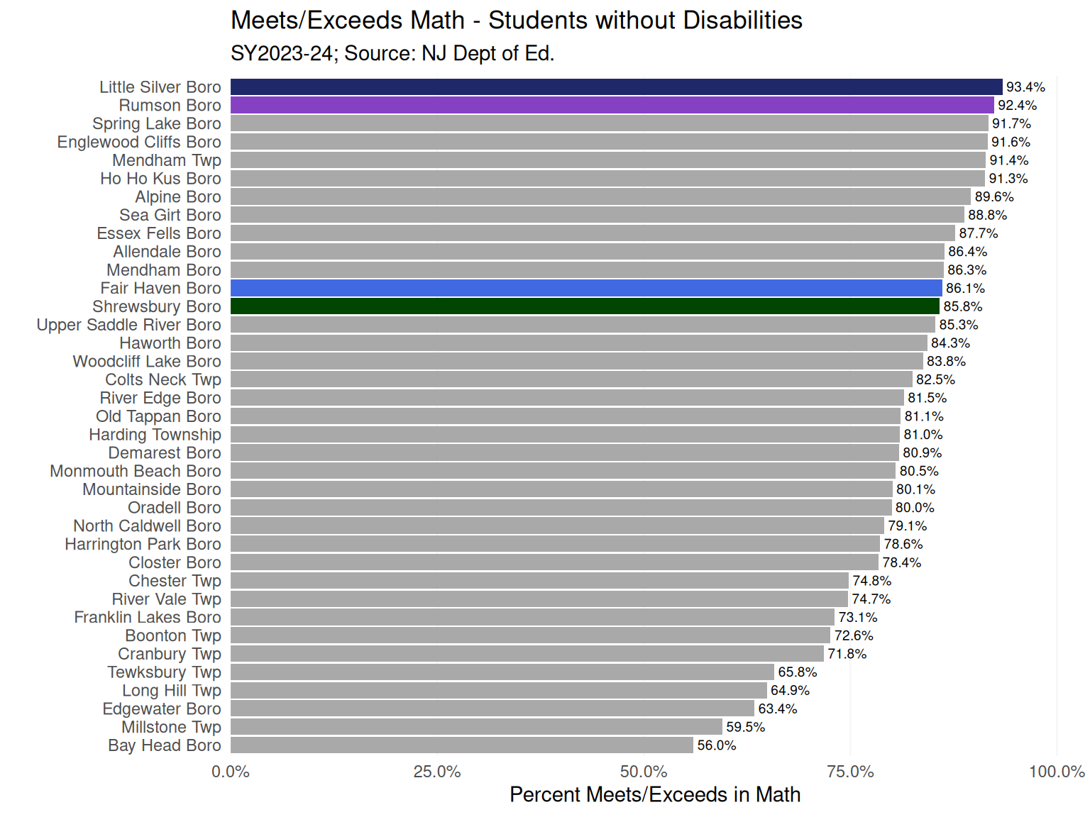
  • When excluding students with disabilities, rates of meeting or exceeding expectations in Math for all districts increased. Fair Haven and geographic peers were all about 85%. (Figure 16).
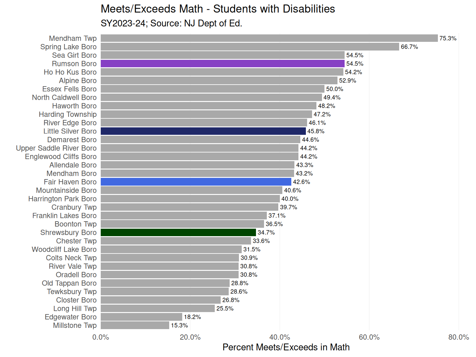
  • When restricting to students with disabilities, about 43% Fair Haven students met or exceeded expectations in Math, compared to about 55% in Rumson (Figure 17).
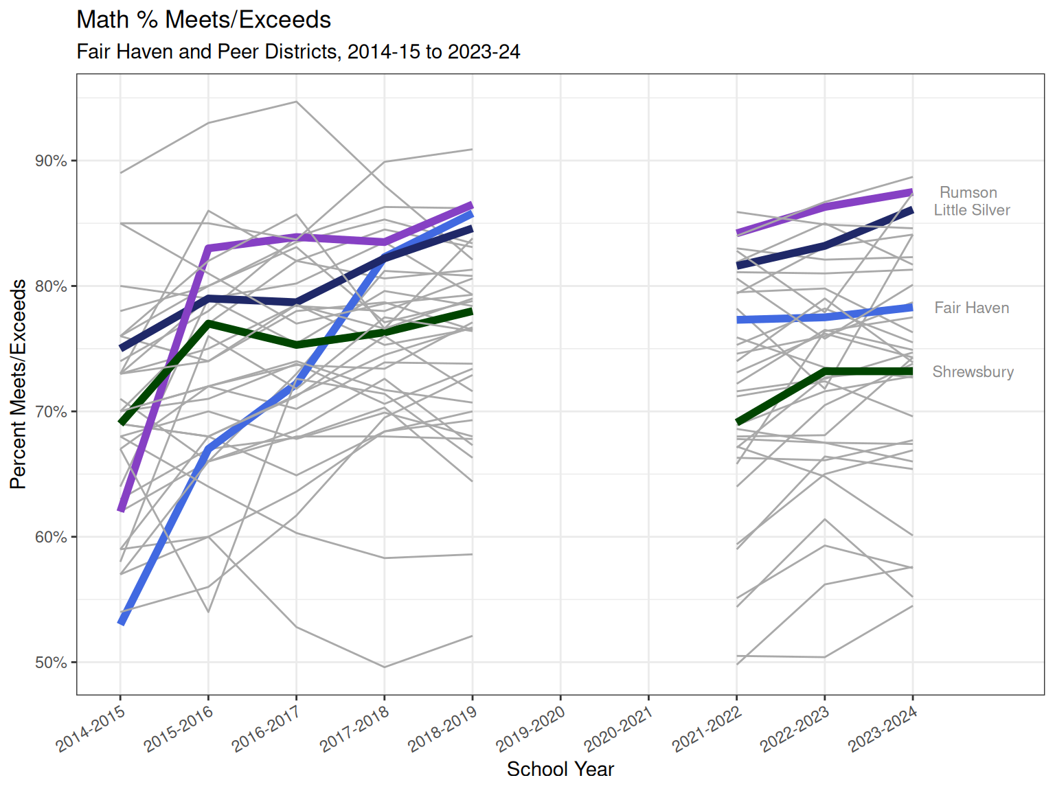
  • Over time, Fair Haven showed steep improvement in Math from 2014-15 to 2018-19 before dipping and remaining flat after the Covid-19 pandemic. Note that the earliest part of this time series (2014-15) was when the state replaced the NJASK test with the PARCC test. Districts that were ill-prepared for the change generally saw low test scores in the early days. In 2018-19 the NJSLA replaced PARCC (though NJSLA is similar to PARCC). (Figure 18)

ELA outcomes

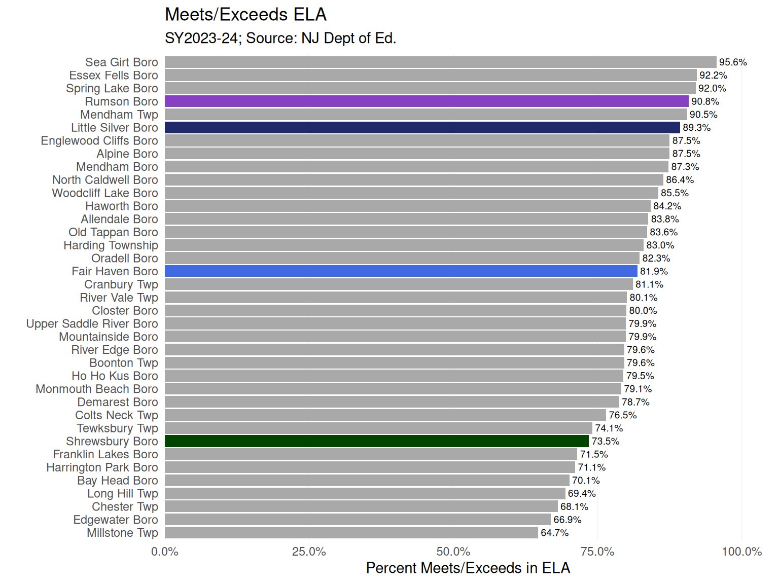
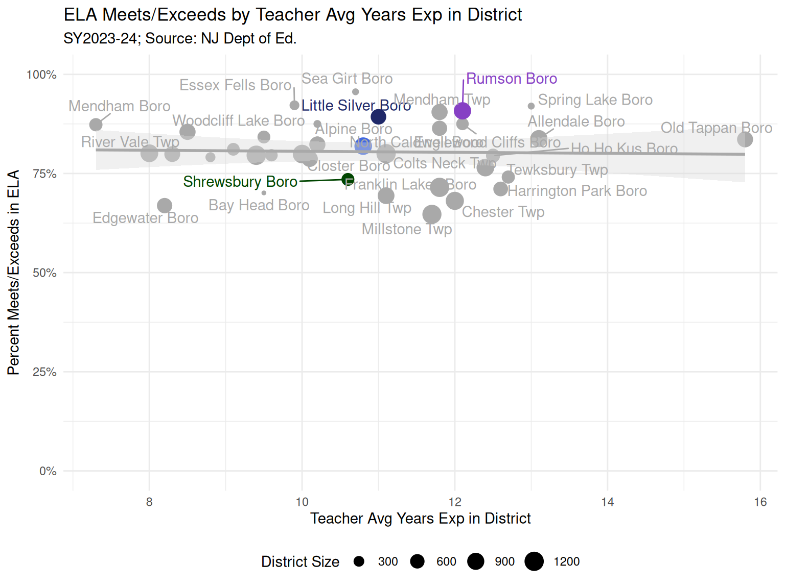
  • For ELA (English Language Arts), most districts in the peer group had at least 77% of students meeting or exceeding expectations according to state standardized tests in grades 3-8, with Fair Haven in the middle 3rd of the pack at 81.9% (Figure 19)
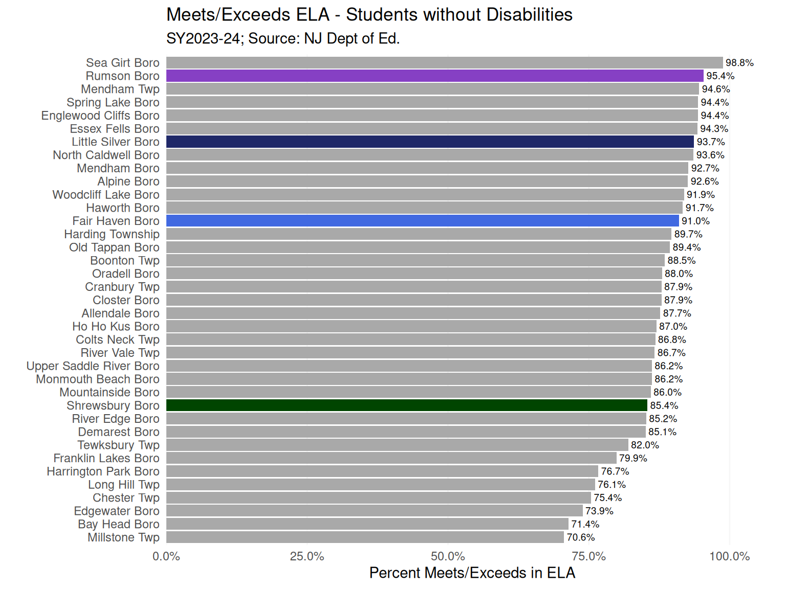
  • When excluding students with disabilities, rates of meeting or exceeding expectations in ELA for all districts increased. Fair Haven had 91% meet or exceeds in ELA. (Figure 22)
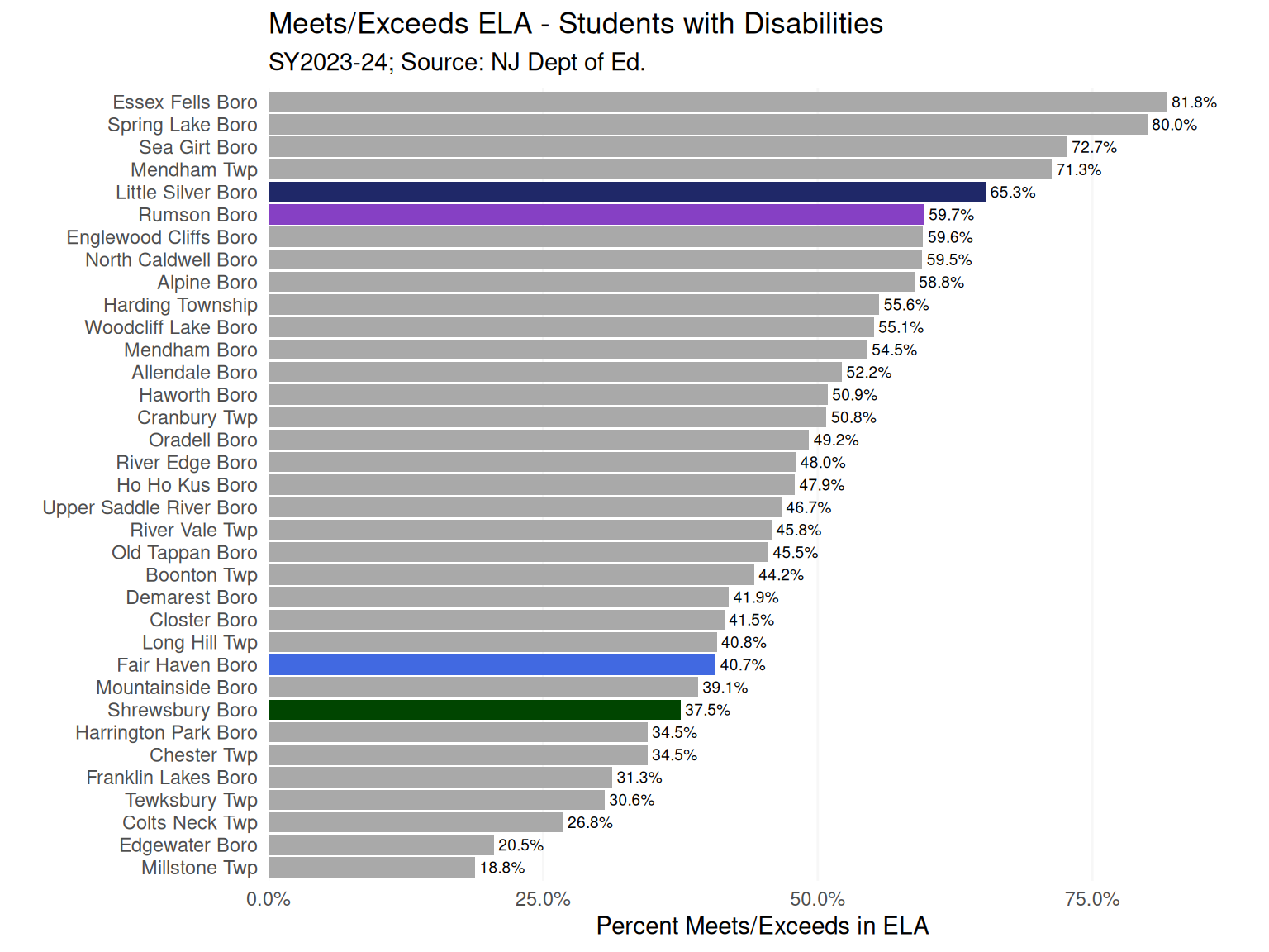
  • When restricting to students with disabilities, about 41% Fair Haven students met or exceeded expectations in ELA, compared to about 65% in Little Silver (Figure 23)
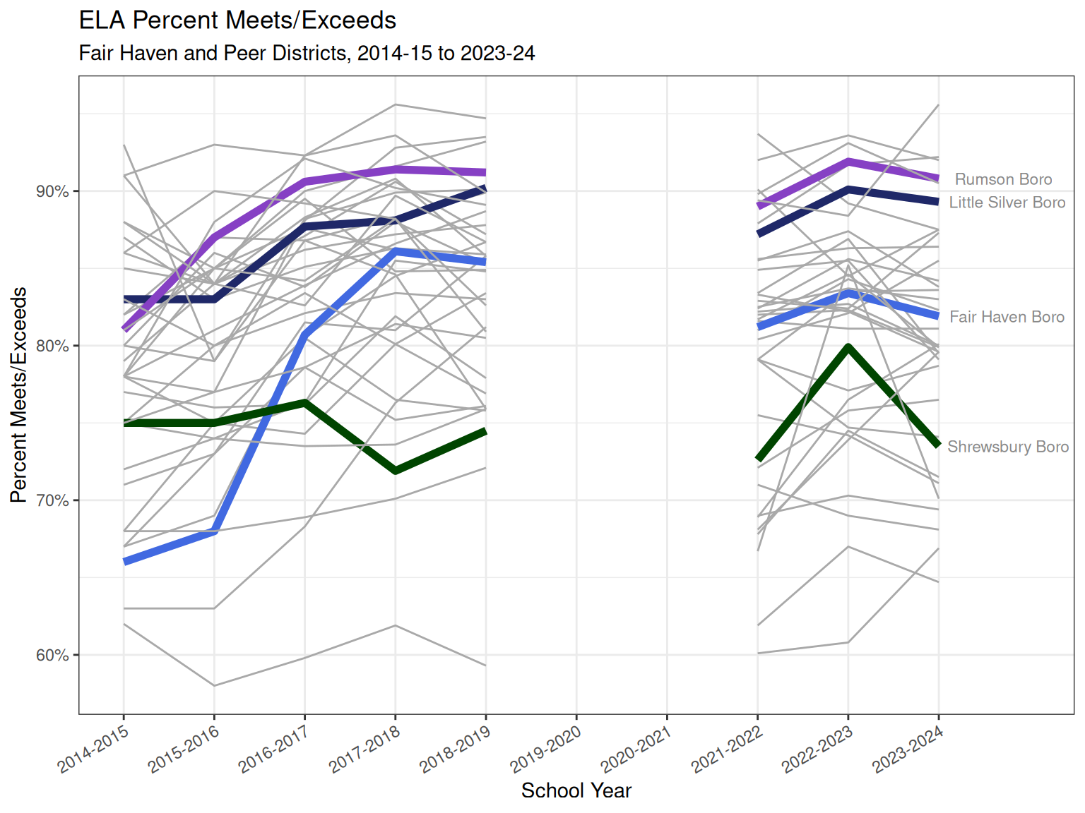
  • Over time, Fair Haven showed steep improvement in ELA from 2014-15 to 2018-19 before dipping and remaining flat after the Covid-19 pandemic. (Figure 24)

Outcomes and inputs

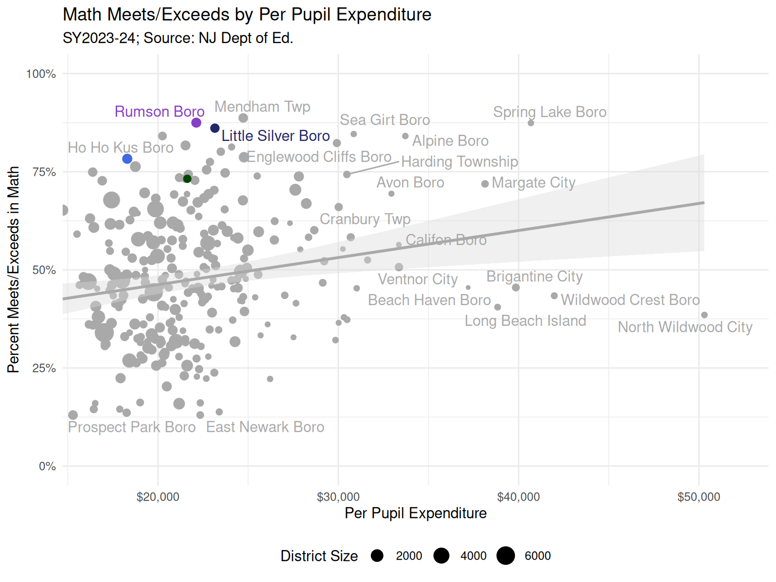
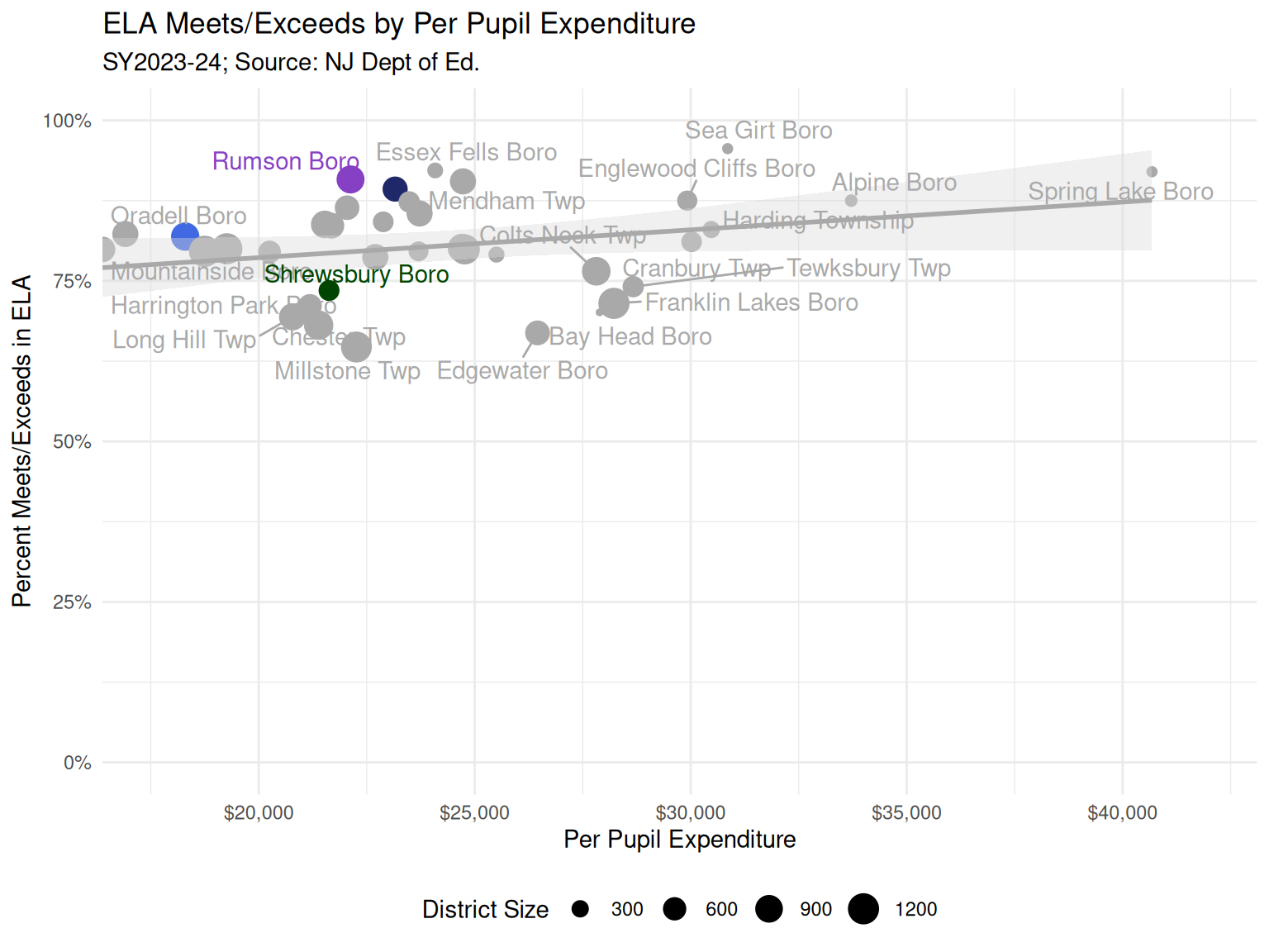
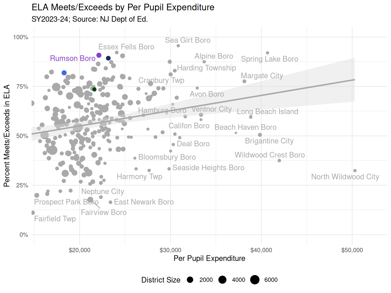
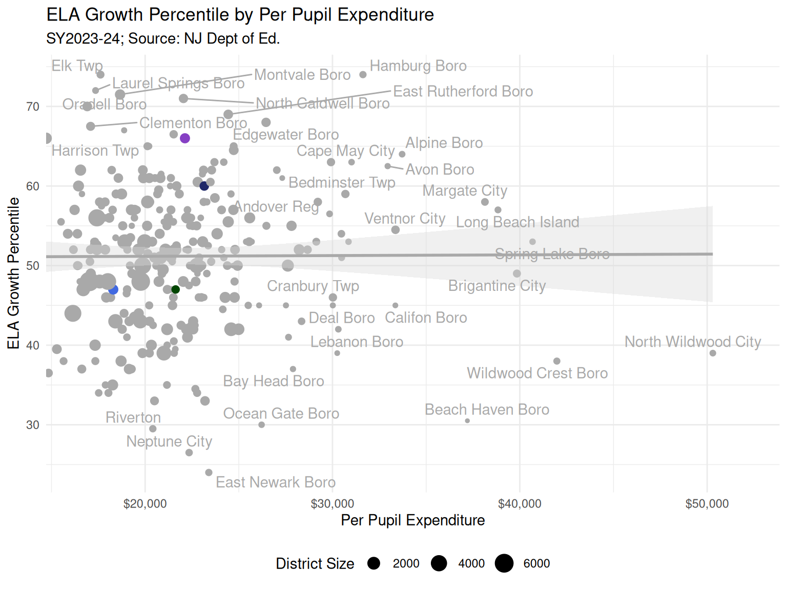
  • Relationships between outcomes (like Math and ELA achievement) and inputs (like expenditures per pupil) often show weak positive relationships, which is not unexpected. One reason to examine this relationship between only Fair Haven and similar peers is to compare like with like as best as possible and reduce biases coming from unmeasured or omitted factors (Figure 25 and Figure 37).
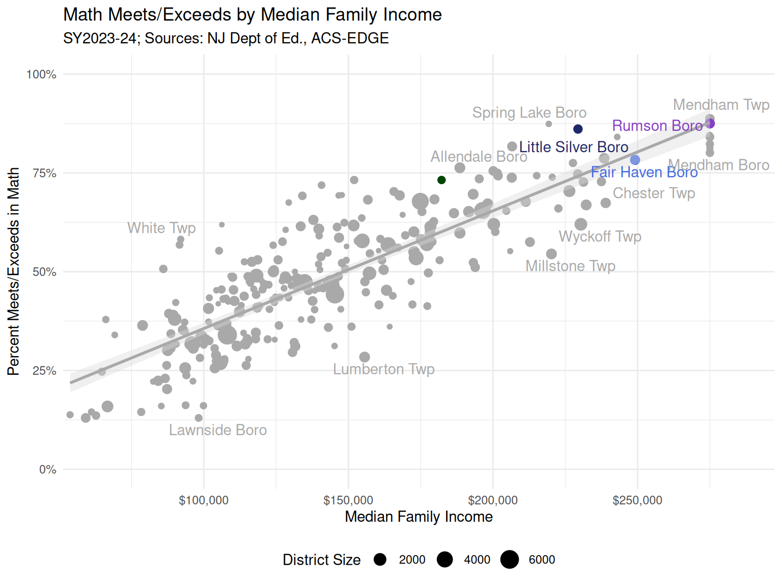
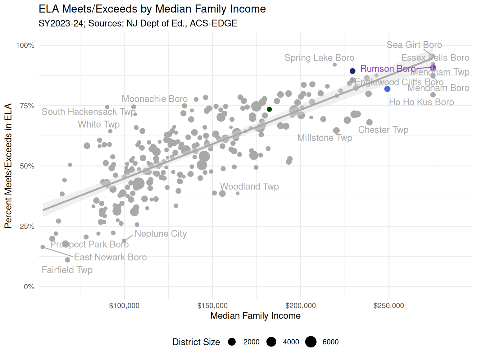
  • One relationship that is particularly strong is between district median family income and Math and ELA achievement (Figure 27 and Figure 39). I find these relationships to be a clear reminder of the socioeconomic diversity present in our State as well as the privilege that many of us share in the Peninsula area.
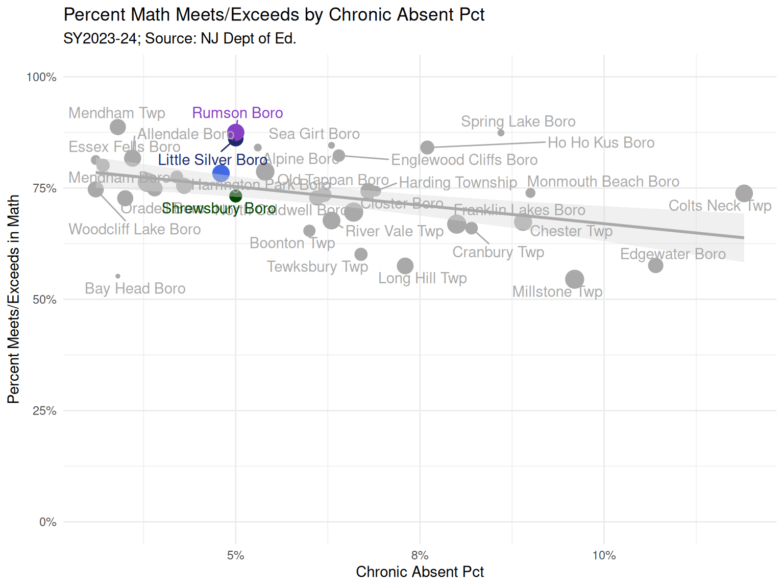
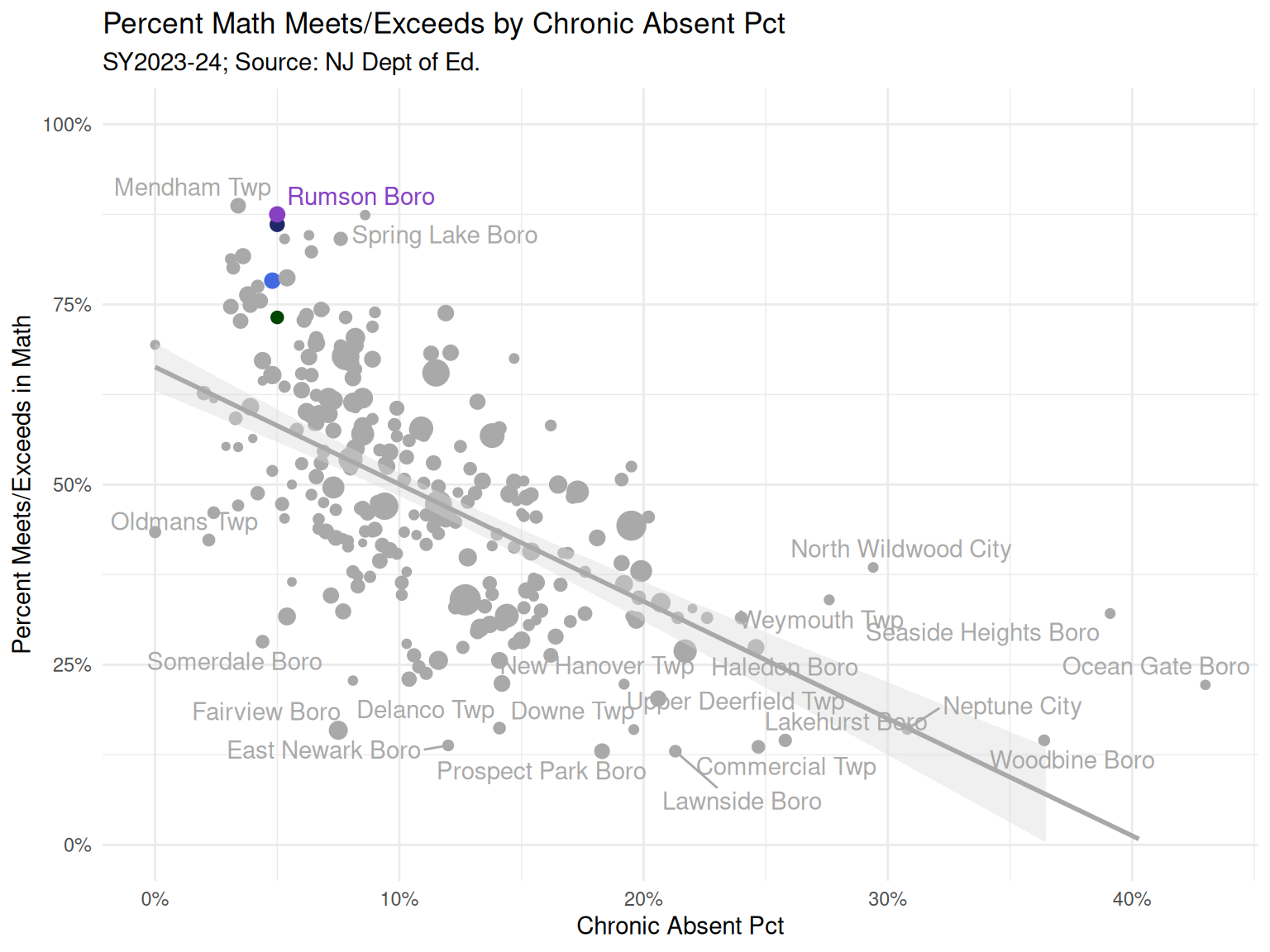
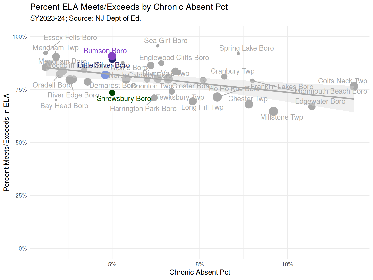
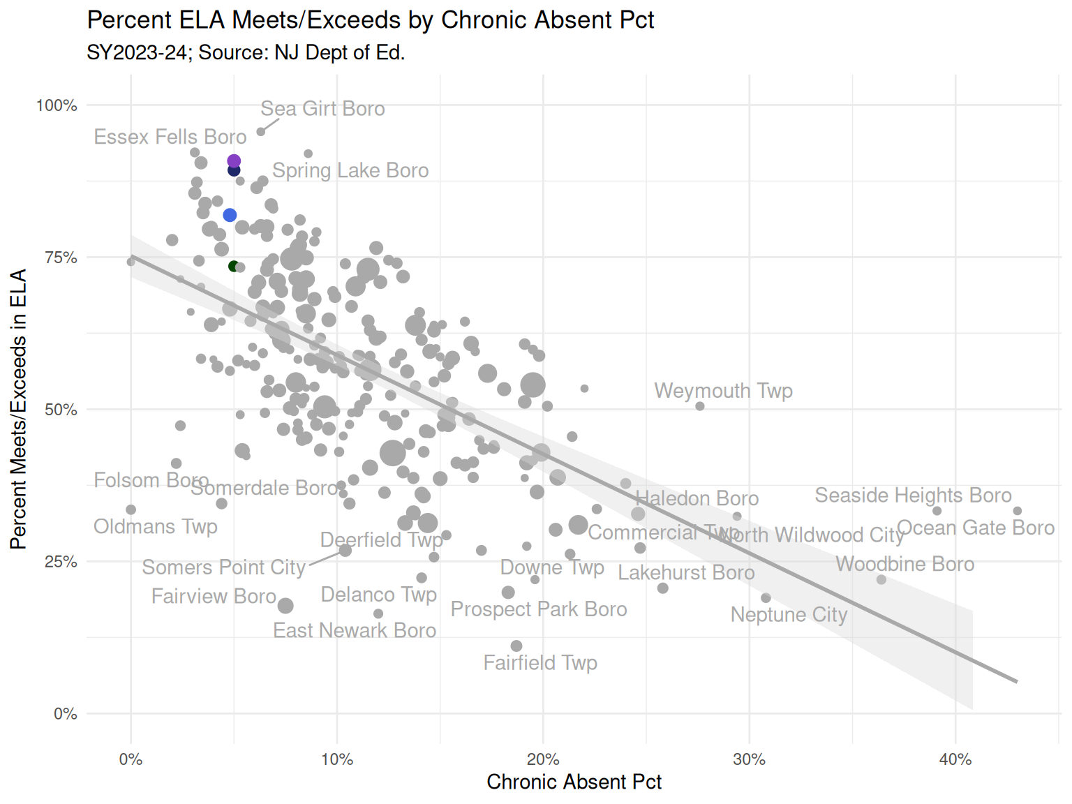
  • Another relationshp that stood out to me was between chronic absence and achievement. Figure 35 and Figure 47 show the negative relationship between chronic absence and Math and ELA achievement. Figure 36 and Figure 48 shows it for all districts.

Summary

In 2023-24, Fair Haven spent less per student overall and on instruction compared to peers, but directed a high percentage of its budget to the classroom. It had the lowest administrative costs and a young teaching staff. Chronic absences improved to match neighbors. About 15.6% of students had disabilities, placing Fair Haven in the middle of its peer group.

Academic outcomes in Math (78.3%) and ELA (81.9%) were in the middle range compared to peers. Excluding students with disabilities, these rates improved significantly. However, students with disabilities showed lower achievement in both subjects than some peers. Achievement improved notably from 2014-15 to 2018-19 before leveling off post-pandemic.

Within the peer group, per-pupil spending had a weak link to outcomes, but median family income strongly correlated with achievement across all districts. Higher chronic absence was linked to lower Math and ELA scores.

Despite the richness of these data, they are limited in what they reveal about the educational landscape in Fair Haven. Though I do believe that this is a decent starting point for helping folks to align on a set of facts that can lead to fruitful conversations with practitioners.

Figures

Code - Load libraries
options(width = 120)

library(tidyverse)
library(cluster)
library(MASS)
library(ggpmisc)
library(ggrepel)
library(glue)
library(DT)
library(factoextra)
library(gt)
library(purrr)

set.seed(2024)

# Commonly used State ID numbers (staid) and Federal Local Education Authority (LEA) IDs
# for FH, Little Silver, Rumson, and Shrewsbury
fh_leaid <- "3404950"
fh_staid <- "NJ-251440"

ls_leaid <- "3408790"
ls_staid <- "NJ-252720"

rums_leaid <- "3414370"
rums_staid <- "NJ-254570"

shrews_leaid <- "3414970"
shrews_staid <- "NJ-254770"

district_name_colors <- c(
  "Fair Haven Boro" = "#4169E1",
  "Little Silver Boro" = "#1F2868",
  "Rumson Boro" = "#8640C4",
  "Shrewsbury Boro" = "#004500",
  "Other" = "darkgrey"
)

district_stleaid_colors <-  c("#4169E1", "#1F2868", "#8640C4", "#004500", "lightgrey")
names(district_stleaid_colors) <-c(fh_staid, ls_staid, rums_staid, shrews_staid, "Other")

knitr::opts_chunk$set(
    fig.width = 8,    
    fig.height = 10,
    fig.align = "center"
)

sy <- "SY2023-24"
Code - Load data
comb2324 <- read_csv("datasets/comb2324.csv")

comb2324 <- comb2324 %>%
  dplyr::mutate(
    TotalEnrollment=as.numeric(TotalEnrollment),
    student_teacher_ratio = as.numeric(student_teacher_ratio),
    student_admin_ratio = as.numeric(student_admin_ratio),
    TeacherAvgYearsExp_School = as.numeric(TeacherAvgYearsExp_School),
    TeacherAvgYearsExpInDistrict_School = as.numeric(TeacherAvgYearsExpInDistrict_School),
    PercentageOfOutOfFieldTeachers = as.numeric(PercentageOfOutOfFieldTeachers)/100,
    PercentageTeachersWithProvisionalCredentials_School =as.numeric(PercentageTeachersWithProvisionalCredentials_School)/100,
    Chronic_Abs_Pct = as.numeric(Chronic_Abs_Pct)/100,
    `Students with Disabilities`=as.numeric(`Students with Disabilities`)/100,
    MATH_ME_District=MATH_ME_District/100,
    MATH_ME_District_notdis=MATH_ME_District_notdis/100,
    MATH_ME_District_dis=MATH_ME_District_dis/100,
    ELA_ME_District=ELA_ME_District/100,
    ELA_ME_District_notdis=ELA_ME_District_notdis/100,
    ELA_ME_District_dis=ELA_ME_District_dis/100)

rc_all_comb <- read_csv("datasets/rc_all_comb.csv")

outcomes_time <- rc_all_comb %>% 
  dplyr::select(ST_LEAID, SchoolYear, DistrictName, ELA_ME_District, MATH_ME_District, disab_pct=`Students with Disabilities`,
                TotalEnrollment, mSGP_ELA, mSGP_Math, ELA_ME_District_dis, ELA_ME_District_notdis,
                MATH_ME_District_dis, MATH_ME_District_notdis, MATH_pct_level5, MATH_pct_level5_nogr8, 
                ELA_pct_level5, Chronic_Abs_Pct) %>%
  dplyr::mutate(
      SchoolYear = ifelse(SchoolYear=="2023-24", "2023-2024", SchoolYear),
    year=case_when(
      SchoolYear == "2014-2015" ~ 1,
      SchoolYear == "2015-2016" ~ 2,
      SchoolYear == "2016-2017" ~ 3,
      SchoolYear == "2017-2018" ~ 4,
      SchoolYear == "2018-2019" ~ 5,
      SchoolYear == "2019-2020" ~ 6,
      SchoolYear == "2020-2021" ~ 7,
      SchoolYear == "2021-2022" ~ 8,
      SchoolYear == "2022-2023" ~ 9,
      SchoolYear == "2023-2024" ~ 10,
    ),
    Chronic_Abs_Pct = as.numeric(Chronic_Abs_Pct)/100,
    disab_pct=as.numeric(disab_pct)/100,
    MATH_ME_District=as.numeric(MATH_ME_District)/100,
    MATH_ME_District_notdis=as.numeric(MATH_ME_District_notdis)/100,
    MATH_ME_District_dis=as.numeric(MATH_ME_District_dis)/100,
    ELA_ME_District=as.numeric(ELA_ME_District)/100,
    ELA_ME_District_notdis=as.numeric(ELA_ME_District_notdis)/100,
    ELA_ME_District_dis=as.numeric(ELA_ME_District_dis)/100,
    TotalEnrollment = as.numeric(TotalEnrollment)
    ) %>%
  dplyr::filter(ST_LEAID %in% comb2324$ST_LEAID[comb2324$hc_euclid_ward & comb2324$TotalEnrollment <1500])

#disab_pct is missing for 2014-15
outcomes_time <- outcomes_time %>% dplyr::rename(stleaid=ST_LEAID)
outcomes_time$dist_colors <- comb2324$dist_colors[match(outcomes_time$stleaid, comb2324$ST_LEAID)]
outcomes_time$dist_size <- if_else(outcomes_time$dist_colors=="Other", .5, 2)

Per pupil costs

Code - Per pupil costs
comb2324 %>%
  dplyr::filter(hc_euclid_ward, TotalEnrollment < 1500) %>%
  dplyr::mutate(district_name = fct_reorder(district_name, per_pupil_cost)) %>%
  {
    ggplot(data=., aes(x=per_pupil_cost, y=district_name, fill=dist_colors)) +
    geom_bar(stat="identity", position="dodge") +
    theme_minimal() +
    labs(x="Total Budgetary Comparative Per Pupil Cost", y="") +
    ggtitle("Total District Per Pupil Cost in Peer Group", subtitle = paste0(sy, "; Source: NJ Dept of Ed.")) +
    scale_fill_manual(values=district_name_colors, guide="none") +
    scale_x_continuous(labels = scales::dollar, expand = expansion(mult = c(0, 0.1))) +
    geom_text(aes(label=scales::dollar(per_pupil_cost), x=per_pupil_cost), size=2.5, hjust=-.1) +
    theme(panel.grid.major.y = element_blank()) +
    theme(panel.grid.minor.y = element_blank()) +
    theme(panel.grid.major.x = element_line(color="grey97")) +
    theme(panel.grid.minor.x = element_blank()) 
  }
Figure 1: Per pupil costs
Code - Per pupil instructional costs
comb2324 %>%
  dplyr::filter(hc_euclid_ward, TotalEnrollment < 1500) %>%
  dplyr::mutate(district_name = fct_reorder(district_name, per_pupil_class_instruction)) %>%
  {
    ggplot(data=., aes(x=per_pupil_class_instruction, y=district_name, fill=dist_colors)) +
      geom_bar(stat="identity", position="dodge") +
      theme_minimal() +
      labs(x="Total Per Pupil Classroom Instruction", y="") +
      ggtitle("Total District Per Pupil Classroom Instruction in Peer Group", subtitle = paste0(sy, "; Source: NJ Dept of Ed.")) +
      scale_fill_manual(values=district_name_colors, guide="none") +
      scale_x_continuous(labels = scales::dollar, expand = expansion(mult = c(0, 0.1))) +
      geom_text(aes(label=scales::dollar(per_pupil_class_instruction), x=per_pupil_class_instruction), size=2.5, hjust=-.1)  +
    theme(panel.grid.major.y = element_blank()) +
    theme(panel.grid.minor.y = element_blank()) +
    theme(panel.grid.major.x = element_line(color="grey97")) +
    theme(panel.grid.minor.x = element_blank()) 
  }
Figure 2: Per pupil instructional costs
Code - Per pupil administrative costs
comb2324 %>%
  dplyr::filter(hc_euclid_ward, TotalEnrollment < 1500) %>%
  dplyr::mutate(district_name = fct_reorder(district_name, per_pupil_admin_cost)) %>%
  {
    ggplot(data=., aes(x=per_pupil_admin_cost, y=district_name, fill=dist_colors)) +
      geom_bar(stat="identity", position="dodge") +
      theme_minimal() +
      labs(x="Total Per Pupil Admin Cost", y="") +
      ggtitle("Total District Admin Cost in Peer Group", subtitle = paste0(sy, "; Source: NJ Dept of Ed.")) +
      scale_fill_manual(values=district_name_colors, guide="none") +
      scale_x_continuous(labels = scales::dollar, expand = expansion(mult = c(0, 0.1))) +
      geom_text(aes(label=scales::dollar(per_pupil_admin_cost), x=per_pupil_admin_cost), size=2.5, hjust=-.1)  +
      theme(panel.grid.major.y = element_blank()) +
      theme(panel.grid.minor.y = element_blank()) +
      theme(panel.grid.major.x = element_line(color="grey97")) +
      theme(panel.grid.minor.x = element_blank()) 
  }
Figure 3: Per pupil administrative costs
Code - Per pupil instructional percentage
comb2324 %>%
  dplyr::filter(hc_euclid_ward, TotalEnrollment < 1500) %>%
  dplyr::mutate(inst_pct = per_pupil_class_instruction/ per_pupil_cost) %>%
  dplyr::mutate(district_name = fct_reorder(district_name, inst_pct)) %>%
  {
    ggplot(data=., aes(x=inst_pct, y=district_name, fill=dist_colors)) +
      geom_bar(stat="identity", position="dodge") +
      theme_minimal() +
      labs(x="Instruction Percentage of Total Cost", y="") +
      ggtitle("Instruction Percentage of Total Cost", subtitle = paste0(sy, "; Source: NJ Dept of Ed.")) +
      scale_fill_manual(values=district_name_colors, guide="none") +
      geom_text(aes(label=scales::percent(inst_pct, accuracy = .1), x=inst_pct), size=2.5, hjust=-.1) +
      scale_x_continuous(labels = scales::label_percent(accuracy = 1), expand = expansion(mult = c(0, 0.1)))  +
      theme(panel.grid.major.y = element_blank()) +
      theme(panel.grid.minor.y = element_blank()) +
      theme(panel.grid.major.x = element_line(color="grey97")) +
      theme(panel.grid.minor.x = element_blank()) 
  }
Figure 4: Per pupil instructional percentage

Teacher and Administrative characteristics

Code - Student-Teacher Ratio
comb2324 %>%
  dplyr::filter(hc_euclid_ward, TotalEnrollment < 1500) %>%
  dplyr::mutate(district_name = fct_reorder(district_name, student_teacher_ratio)) %>%
  {
    ggplot(data=., aes(x=student_teacher_ratio, y=district_name, fill=dist_colors)) +
      geom_bar(stat="identity", position="dodge") +
      theme_minimal() +
      labs(x="Student-Teacher Ratio", y="") +
      ggtitle("Student-Teacher Ratio", subtitle = paste0(sy, "; Source: NJ Dept of Ed.")) +
      scale_fill_manual(values=district_name_colors, guide="none") +
      scale_x_continuous(expand = expansion(mult = c(0, 0.1))) +
      geom_text(aes(label=student_teacher_ratio, x=student_teacher_ratio), size=2.5, hjust=-.1) +
      theme(panel.grid.major.y = element_blank()) +
      theme(panel.grid.minor.y = element_blank()) +
      theme(panel.grid.major.x = element_line(color="grey97")) +
      theme(panel.grid.minor.x = element_blank()) 
  }
Figure 5: Student-Teacher Ratio
Code - Student-Admin Ratio
comb2324 %>%
  dplyr::filter(hc_euclid_ward, TotalEnrollment < 1500) %>%
  dplyr::mutate(district_name = fct_reorder(district_name, student_admin_ratio)) %>%
  {
    ggplot(data=., aes(x=student_admin_ratio, y=district_name, fill=dist_colors)) +
      geom_bar(stat="identity", position="dodge") +
      theme_minimal() +
      labs(x="Student-Admin Ratio", y="") +
      ggtitle("Student-Admin Ratio", subtitle = paste0(sy, "; Source: NJ Dept of Ed.")) +
      scale_fill_manual(values=district_name_colors, guide="none") +
      geom_text(aes(label=student_admin_ratio, x=student_admin_ratio), size=2.5, hjust=-.1) +
      scale_x_continuous(expand = expansion(mult = c(0, 0.1))) +
      theme(panel.grid.major.y = element_blank()) +
      theme(panel.grid.minor.y = element_blank()) +
      theme(panel.grid.major.x = element_line(color="grey97")) +
      theme(panel.grid.minor.x = element_blank()) 
  }
Figure 6: Student-Admin Ratio
Code - Teacher years experience
comb2324 %>%
  dplyr::filter(hc_euclid_ward, TotalEnrollment < 1500) %>%
  dplyr::mutate(district_name = fct_reorder(district_name, TeacherAvgYearsExp_School)) %>%
  {
    ggplot(data=., aes(x=TeacherAvgYearsExp_School, y=district_name, fill=dist_colors)) +
      geom_bar(stat="identity", position="dodge") +
      theme_minimal() +
      labs(x="Teacher Average Years of Experience", y="") +
      ggtitle("Teacher Average Years Experience", subtitle = paste0(sy, "; Source: NJ Dept of Ed.")) +
      scale_fill_manual(values=district_name_colors, guide="none") +
      geom_text(aes(label=TeacherAvgYearsExp_School, x=TeacherAvgYearsExp_School), size=2.5, hjust=-.1) +
      scale_x_continuous(expand = expansion(mult = c(0, 0.1))) +
      theme(panel.grid.major.y = element_blank()) +
      theme(panel.grid.minor.y = element_blank()) +
      theme(panel.grid.major.x = element_line(color="grey97")) +
      theme(panel.grid.minor.x = element_blank()) 
  }
Figure 7: Teacher years experience
Code - Teacher years experience in district
comb2324 %>%
  dplyr::filter(hc_euclid_ward, TotalEnrollment < 1500) %>%
  dplyr::mutate(district_name = fct_reorder(district_name, TeacherAvgYearsExpInDistrict_School)) %>%
  {
    ggplot(data=., aes(x=TeacherAvgYearsExpInDistrict_School, y=district_name, fill=dist_colors)) +
      geom_bar(stat="identity", position="dodge") +
      theme_minimal() +
      labs(x="Teacher Average Years Experience in District", y="") +
      ggtitle("Teacher Average Years Experience in District", subtitle = paste0(sy, "; Source: NJ Dept of Ed.")) +
      scale_fill_manual(values=district_name_colors, guide="none") +
      geom_text(aes(label=TeacherAvgYearsExpInDistrict_School, x=TeacherAvgYearsExpInDistrict_School), size=3, hjust=-.1) +
      scale_x_continuous(expand = expansion(mult = c(0, 0.1))) +
      theme(panel.grid.major.y = element_blank()) +
      theme(panel.grid.minor.y = element_blank()) +
      theme(panel.grid.major.x = element_line(color="grey97")) +
      theme(panel.grid.minor.x = element_blank()) 
  }
Figure 8: Teacher years experience in district
Code - Percentage Out of Field Teachers
comb2324 %>%
  dplyr::filter(hc_euclid_ward, TotalEnrollment < 1500) %>%
  dplyr::mutate(district_name = fct_reorder(district_name, PercentageOfOutOfFieldTeachers)) %>%
  {
    ggplot(data=., aes(x=PercentageOfOutOfFieldTeachers, y=district_name, fill=dist_colors)) +
      geom_bar(stat="identity", position="dodge") +
      theme_minimal() +
      labs(x="Percentage Out of Field Teachers", y="") +
      ggtitle("Percentage Out of Field Teachers", subtitle = paste0(sy, "; Source: NJ Dept of Ed.")) +
      scale_fill_manual(values=district_name_colors, guide="none") +
      geom_text(aes(label=scales::percent(PercentageOfOutOfFieldTeachers, accuracy = .1), x=PercentageOfOutOfFieldTeachers), size=2.5, hjust=-.1) +
      scale_x_continuous(labels = scales::label_percent(accuracy = 1), expand = expansion(mult = c(0, 0.1)))  +
      theme(panel.grid.major.y = element_blank()) +
      theme(panel.grid.minor.y = element_blank()) +
      theme(panel.grid.major.x = element_line(color="grey97")) +
      theme(panel.grid.minor.x = element_blank()) 
  }
Figure 9: Percentage Out of Field Teachers
Code - Teachers with Provisional Credential
comb2324 %>%
  dplyr::filter(hc_euclid_ward, TotalEnrollment < 1500) %>%
  dplyr::mutate(district_name = fct_reorder(district_name, PercentageTeachersWithProvisionalCredentials_School)) %>%
  {
    ggplot(data=., aes(x=PercentageTeachersWithProvisionalCredentials_School, y=district_name, fill=dist_colors)) +
      geom_bar(stat="identity", position="dodge") +
      theme_minimal() +
      labs(x="Percentage of Teachers with Provisional Credential", y="") +
      ggtitle("Percentage of Teachers with Provisional Credential", subtitle =paste0(sy, "; Source: NJ Dept of Ed.")) +
      scale_fill_manual(values=district_name_colors, guide="none") +
      geom_text(aes(label=scales::percent(PercentageTeachersWithProvisionalCredentials_School, accuracy = .1), x=PercentageTeachersWithProvisionalCredentials_School), size=2.5, hjust=-.1) +
      scale_x_continuous(labels = scales::label_percent(accuracy = 1), expand = expansion(mult = c(0, 0.1)))  +
      theme(panel.grid.major.y = element_blank()) +
      theme(panel.grid.minor.y = element_blank()) +
      theme(panel.grid.major.x = element_line(color="grey97")) +
      theme(panel.grid.minor.x = element_blank()) 
  }
Figure 10: Teachers with Provisional Credential

Absences

Code - Chronic Absences
# Chronic absenteeism is defined as being absent for 10% or more of the days enrolled during the school year

comb2324 %>%
  dplyr::filter(hc_euclid_ward, TotalEnrollment < 1500) %>%
  dplyr::mutate(district_name = fct_reorder(district_name, Chronic_Abs_Pct)) %>%
  {
    ggplot(data=., aes(x=Chronic_Abs_Pct, y=district_name, fill=dist_colors)) +
      geom_bar(stat="identity", position="dodge") +
      theme_minimal() +
      labs(x="Percentage of Chronically Absent Students (absent 10% or more of enrolled days)", y="") +
      ggtitle("Percentage of Chronically Absent Students", subtitle = paste0(sy, "; Source: NJ Dept of Ed.")) +
      scale_fill_manual(values=district_name_colors, guide="none") +
      geom_text(aes(label=scales::percent(Chronic_Abs_Pct, accuracy = .1), x=Chronic_Abs_Pct), size=2.5, hjust=-.1) +
      scale_x_continuous(labels = scales::label_percent(accuracy = 1), expand = expansion(mult = c(0, 0.1)))  +
      theme(panel.grid.major.y = element_blank()) +
      theme(panel.grid.minor.y = element_blank()) +
      theme(panel.grid.major.x = element_line(color="grey97")) +
      theme(panel.grid.minor.x = element_blank())
  }
Figure 11: Absences

Special Education

Code - Special Ed
comb2324 %>%
  dplyr::filter(hc_euclid_ward, TotalEnrollment < 1500) %>%
  dplyr::mutate(district_name = fct_reorder(district_name, `Students with Disabilities`)) %>%
  {
    ggplot(data=., aes(x=`Students with Disabilities`, y=district_name, fill=dist_colors)) +
      geom_bar(stat="identity", position="dodge") +
      theme_minimal() +
      labs(x="Percent Students with Disabilities", y="") +
      ggtitle("Percent Students with Disabilities", subtitle = paste0(sy, "; Source: NJ Dept of Ed.")) +
      scale_fill_manual(values=district_name_colors, guide="none") +
      geom_text(aes(label=scales::percent(`Students with Disabilities`, accuracy = .1), x=`Students with Disabilities`), size=2.5, hjust=-.1) +
      scale_x_continuous(labels = scales::label_percent(accuracy = .1), expand = expansion(mult = c(0, 0.1)))  +
      theme(panel.grid.major.y = element_blank()) +
      theme(panel.grid.minor.y = element_blank()) +
      theme(panel.grid.major.x = element_line(color="grey97")) +
      theme(panel.grid.minor.x = element_blank()) 
  }
Figure 12: Special Ed

Outcomes

Math

Code - Math Outcomes
comb2324 %>%
  dplyr::filter(hc_euclid_ward, TotalEnrollment < 1500) %>%
  dplyr::mutate(district_name = fct_reorder(district_name, MATH_ME_District)) %>%
  {
    ggplot(data=., aes(x=MATH_ME_District, y=district_name, fill=dist_colors)) +
      geom_bar(stat="identity", position="dodge") +
      theme_minimal() +
      labs(x="Percent Meets/Exceeds in Math", y="") +
      ggtitle("Meets/Exceeds Math", subtitle = paste0(sy, "; Source: NJ Dept of Ed.")) +
      scale_fill_manual(values=district_name_colors, guide="none") +
      geom_text(aes(label=scales::percent(MATH_ME_District, accuracy = .1), x=MATH_ME_District), size=2.5, hjust=-.1) +
      scale_x_continuous(labels = scales::label_percent(accuracy = .1), expand = expansion(mult = c(0, 0.1)))  +
      theme(panel.grid.major.y = element_blank()) +
      theme(panel.grid.minor.y = element_blank()) +
      theme(panel.grid.major.x = element_line(color="grey97")) +
      theme(panel.grid.minor.x = element_blank()) 
  }
Figure 13: Math Outcomes
Code - Math Outcomes - Exceeds
comb2324 %>%
  dplyr::filter(hc_euclid_ward, TotalEnrollment < 1500) %>%
  dplyr::mutate(district_name = fct_reorder(district_name, MATH_pct_level5)) %>%
  {
    ggplot(data=., aes(x=MATH_pct_level5, y=district_name, fill=dist_colors)) +
      geom_bar(stat="identity", position="dodge") +
      theme_minimal() +
      labs(x="Percent Exceeds in Math", y="") +
      ggtitle("Exceeds Math", subtitle = paste0(sy, "; Source: NJ Dept of Ed.")) +
      scale_fill_manual(values=district_name_colors, guide="none") +
      geom_text(aes(label=scales::percent(MATH_pct_level5, accuracy = .1), x=MATH_pct_level5), size=2.5, hjust=-.1) +
      scale_x_continuous(labels = scales::label_percent(accuracy = .1), expand = expansion(mult = c(0, 0.1)))  +
      theme(panel.grid.major.y = element_blank()) +
      theme(panel.grid.minor.y = element_blank()) +
      theme(panel.grid.major.x = element_line(color="grey97")) +
      theme(panel.grid.minor.x = element_blank()) 
  }
Figure 14: Math Outcomes - Exceeds
Code - Math Median Growth
comb2324 %>%
  dplyr::filter(hc_euclid_ward, TotalEnrollment < 1500) %>%
  dplyr::mutate(district_name = fct_reorder(district_name, mSGP_Math)) %>%
  {
    ggplot(data=., aes(x=mSGP_Math, y=district_name, fill=dist_colors)) +
      geom_bar(stat="identity", position="dodge") +
      theme_minimal() +
      labs(x="Math Median Growth Percentile", y="") +
      ggtitle("Math Median Growth", subtitle = paste0(sy, "; Source: NJ Dept of Ed.")) +
      scale_fill_manual(values=district_name_colors, guide="none") +
      geom_text(aes(label=mSGP_Math, x=mSGP_Math), size=2.5, hjust=-.1) +
      scale_x_continuous(expand = expansion(mult = c(0, 0.1)))  +
      theme(panel.grid.major.y = element_blank()) +
      theme(panel.grid.minor.y = element_blank()) +
      theme(panel.grid.major.x = element_line(color="grey97")) +
      theme(panel.grid.minor.x = element_blank()) 
  }
Figure 15: Math Median Growth
Code - Math Outcomes - without Disabilities
comb2324 %>%
  dplyr::filter(hc_euclid_ward, TotalEnrollment < 1500) %>%
  dplyr::mutate(district_name = fct_reorder(district_name, MATH_ME_District_notdis)) %>%
  {
    ggplot(data=., aes(x=MATH_ME_District_notdis, y=district_name, fill=dist_colors)) +
      geom_bar(stat="identity", position="dodge") +
      theme_minimal() +
      labs(x="Percent Meets/Exceeds in Math", y="") +
      ggtitle("Meets/Exceeds Math - Students without Disabilities", subtitle = paste0(sy, "; Source: NJ Dept of Ed.")) +
      scale_fill_manual(values=district_name_colors, guide="none") +
      geom_text(aes(label=scales::percent(MATH_ME_District_notdis, accuracy = .1), x=MATH_ME_District_notdis), size=2.5, hjust=-.1) +
      scale_x_continuous(labels = scales::label_percent(accuracy = .1), expand = expansion(mult = c(0, 0.1)))  +
      theme(panel.grid.major.y = element_blank()) +
      theme(panel.grid.minor.y = element_blank()) +
      theme(panel.grid.major.x = element_line(color="grey97")) +
      theme(panel.grid.minor.x = element_blank()) 
  }
Figure 16: Math Outcomes - without Disabilities
Code - Math Outcomes - Disabilities
comb2324 %>%
  dplyr::filter(hc_euclid_ward, TotalEnrollment < 1500, !is.na(MATH_ME_District_dis)) %>%
  dplyr::mutate(district_name = fct_reorder(district_name, MATH_ME_District_dis)) %>% 
  {
    ggplot(data=., aes(x=MATH_ME_District_dis, y=district_name, fill=dist_colors)) +
      geom_bar(stat="identity", position="dodge") +
      theme_minimal() +
      labs(x="Percent Meets/Exceeds in Math", y="") +
      ggtitle("Meets/Exceeds Math - Students with Disabilities", subtitle = paste0(sy, "; Source: NJ Dept of Ed.")) +
      scale_fill_manual(values=district_name_colors, guide="none") +
      geom_text(aes(label=scales::percent(MATH_ME_District_dis, accuracy = .1), x=MATH_ME_District_dis), size=2.5, hjust=-.1) +
      scale_x_continuous(labels = scales::label_percent(accuracy = .1), expand = expansion(mult = c(0, 0.1)))  +
      theme(panel.grid.major.y = element_blank()) +
      theme(panel.grid.minor.y = element_blank()) +
      theme(panel.grid.major.x = element_line(color="grey97")) +
      theme(panel.grid.minor.x = element_blank()) 
  }
Figure 17: Math Outcomes - Disabilities
Code - Math Meets/Exceeds over Time
all_years <- paste(2014:2023, 2015:2024, sep = "-")
years_vector <- setNames(all_years, 1:10) # Corrected to align names and values

# Use dplyr::full_join with a dummy data frame to ensure all levels are present
data_full <- outcomes_time %>%
  full_join(data.frame(SchoolYear = factor(all_years, levels = all_years)), by = "SchoolYear") %>%
  dplyr::mutate(dist_colors = fct_relevel(dist_colors, rev(unique(outcomes_time$dist_colors))))

data_full$DistrictName <- str_trim(str_replace_all(comb2324$LEA_NAME, "School District|Borough|Boro", "")[match(data_full$stleaid, comb2324$ST_LEAID)])


ggplot(aes(x=SchoolYear, y=MATH_ME_District, group=stleaid, color=dist_colors), data=data_full)  +
  geom_line(aes(size=dist_size)) +
  #geom_smooth(aes(group=NA, color=NA), method="loess") +
  scale_x_discrete(labels = all_years, expand = expansion(add=c(.5,1.5))) +
  theme_bw() +
  scale_color_manual("District", values=district_name_colors, labels =c("Shrewsbury", "Rumson", "Little Silver", "Fair Haven", "Others"), guide='none')  +
  labs(title = "Math % Meets/Exceeds", subtitle = "Fair Haven and Peer Districts, 2014-15 to 2023-24", x="School Year", y="Percent Meets/Exceeds")  +
  scale_size(guide = 'none', range = c(0.5, 2)) +
  scale_y_continuous(labels = scales::label_percent(accuracy = 1)) +
  theme(axis.text.x = element_text(angle = 30, hjust = 1)) +
  geom_text(data = data_full %>% filter(SchoolYear == "2023-2024", dist_colors != "Other"),
            aes(label = DistrictName, x = 10.5) , hjust = 0.3,  color = "#888888", size = 3)
Figure 18: Math Meets/Exceeds over Time

ELA

Code - ELA Outcomes
comb2324 %>%
  dplyr::filter(hc_euclid_ward, TotalEnrollment < 1500) %>%
  dplyr::mutate(district_name = fct_reorder(district_name, ELA_ME_District)) %>% 
  {
    ggplot(data=., aes(x=ELA_ME_District, y=district_name, fill=dist_colors)) +
      geom_bar(stat="identity", position="dodge") +
      theme_minimal() +
      labs(x="Percent Meets/Exceeds in ELA", y="") +
      ggtitle("Meets/Exceeds ELA", subtitle = paste0(sy, "; Source: NJ Dept of Ed.")) +
      scale_fill_manual(values=district_name_colors, guide="none") +
      geom_text(aes(label=scales::percent(ELA_ME_District, accuracy = .1), x=ELA_ME_District), size=2.5, hjust=-.1) +
      scale_x_continuous(labels = scales::label_percent(accuracy = .1), expand = expansion(mult = c(0, 0.1)))  +
      theme(panel.grid.major.y = element_blank()) +
      theme(panel.grid.minor.y = element_blank()) +
      theme(panel.grid.major.x = element_line(color="grey97")) +
      theme(panel.grid.minor.x = element_blank()) 
  }
Figure 19: ELA Outcomes
Code - ELA Outcomes - Exceeds
comb2324 %>%
  dplyr::filter(hc_euclid_ward, TotalEnrollment < 1500, !is.na(ELA_pct_level5)) %>%
  dplyr::mutate(district_name = fct_reorder(district_name, ELA_pct_level5)) %>%
  {
    ggplot(data=., aes(x=ELA_pct_level5, y=district_name, fill=dist_colors)) +
      geom_bar(stat="identity", position="dodge") +
      theme_minimal() +
      labs(x="Percent Exceeds in ELA", y="") +
      ggtitle("Exceeds ELA", subtitle = paste0(sy, "; Source: NJ Dept of Ed.")) +
      scale_fill_manual(values=district_name_colors, guide="none") +
      geom_text(aes(label=scales::percent(ELA_pct_level5, accuracy = .1), x=ELA_pct_level5), size=2.5, hjust=-.1) +
      scale_x_continuous(labels = scales::label_percent(accuracy = .1), expand = expansion(mult = c(0, 0.1)))  +
      theme(panel.grid.major.y = element_blank()) +
      theme(panel.grid.minor.y = element_blank()) +
      theme(panel.grid.major.x = element_line(color="grey97")) +
      theme(panel.grid.minor.x = element_blank()) 
  }
Figure 20: ELA Outcomes - Exceeds
Code - ELA Median Growth
comb2324 %>%
  dplyr::filter(hc_euclid_ward, TotalEnrollment < 1500) %>%
  dplyr::mutate(district_name = fct_reorder(district_name, mSGP_ELA)) %>%
  {
    ggplot(data=., aes(x=mSGP_ELA, y=district_name, fill=dist_colors)) +
      geom_bar(stat="identity", position="dodge") +
      theme_minimal() +
      labs(x="ELA Median Growth Percentile", y="") +
      ggtitle("ELA Median Growth", subtitle = paste0(sy, "; Source: NJ Dept of Ed.")) +
      scale_fill_manual(values=district_name_colors, guide="none") +
      geom_text(aes(label=mSGP_ELA, x=mSGP_ELA), size=2.5, hjust=-.1) +
      scale_x_continuous(expand = expansion(mult = c(0, 0.1)))  +
      theme(panel.grid.major.y = element_blank()) +
      theme(panel.grid.minor.y = element_blank()) +
      theme(panel.grid.major.x = element_line(color="grey97")) +
      theme(panel.grid.minor.x = element_blank()) 
  }
Figure 21: ELA Median Growth
Code - ELA Outcomes - without Disabilities
comb2324 %>%
  dplyr::filter(hc_euclid_ward, TotalEnrollment < 1500) %>%
  dplyr::mutate(district_name = fct_reorder(district_name, ELA_ME_District_notdis)) %>%
  {
    ggplot(data=., aes(x=ELA_ME_District_notdis, y=district_name, fill=dist_colors)) +
      geom_bar(stat="identity", position="dodge") +
      theme_minimal() +
      labs(x="Percent Meets/Exceeds in ELA", y="") +
      ggtitle("Meets/Exceeds ELA - Students without Disabilities", subtitle = paste0(sy, "; Source: NJ Dept of Ed.")) +
      scale_fill_manual(values=district_name_colors, guide="none") +
      geom_text(aes(label=scales::percent(ELA_ME_District_notdis, accuracy = .1), x=ELA_ME_District_notdis), size=2.5, hjust=-.1) +
      scale_x_continuous(labels = scales::label_percent(accuracy = .1), expand = expansion(mult = c(0, 0.1)))  +
      theme(panel.grid.major.y = element_blank()) +
      theme(panel.grid.minor.y = element_blank()) +
      theme(panel.grid.major.x = element_line(color="grey97")) +
      theme(panel.grid.minor.x = element_blank()) 
  }
Figure 22: ELA Outcomes - without Disabilities
Code - ELA Outcomes - Disabilities
comb2324 %>%
  dplyr::filter(hc_euclid_ward, TotalEnrollment < 1500, !is.na(ELA_ME_District_dis)) %>%
  dplyr::mutate(district_name = fct_reorder(district_name, ELA_ME_District_dis)) %>%
  {
    ggplot(data=., aes(x=ELA_ME_District_dis, y=district_name, fill=dist_colors)) +
      geom_bar(stat="identity", position="dodge") +
      theme_minimal() +
      labs(x="Percent Meets/Exceeds in ELA", y="") +
      ggtitle("Meets/Exceeds ELA - Students with Disabilities", subtitle = paste0(sy, "; Source: NJ Dept of Ed.")) +
      scale_fill_manual(values=district_name_colors, guide="none") +
      geom_text(aes(label=scales::percent(ELA_ME_District_dis, accuracy = .1), x=ELA_ME_District_dis), size=2.5, hjust=-.1) +
      scale_x_continuous(labels = scales::label_percent(accuracy = .1), expand = expansion(mult = c(0, 0.1)))  +
      theme(panel.grid.major.y = element_blank()) +
      theme(panel.grid.minor.y = element_blank()) +
      theme(panel.grid.major.x = element_line(color="grey97")) +
      theme(panel.grid.minor.x = element_blank()) 
  }
Figure 23: ELA Outcomes - Disabilities
Code - ELA Meets/Exceeds over Time
all_years <- paste(2014:2023, 2015:2024, sep = "-")
years_vector <- setNames(all_years, 1:10) # Corrected to align names and values

# Use dplyr::full_join with a dummy data frame to ensure all levels are present
data_full <- outcomes_time %>%
  full_join(data.frame(SchoolYear = factor(all_years, levels = all_years)), by = "SchoolYear") %>%
  dplyr::mutate(dist_colors = fct_relevel(dist_colors, rev(unique(outcomes_time$dist_colors)))) 

data_full$DistrictName <- str_trim(comb2324$district_name[match(data_full$stleaid, comb2324$ST_LEAID)])

ggplot(aes(x=SchoolYear, y=ELA_ME_District, group=stleaid, color=dist_colors), data=data_full)  +
  geom_line(aes(size=dist_size)) +
  scale_x_discrete(labels = all_years, expand = expansion(add=c(.5,1.5))) +
  theme_bw() +
  scale_color_manual("District", values=district_name_colors, labels =c("Shrewsbury", "Rumson", "Little Silver", "Fair Haven", "Others"), guide='none')  +
  labs(title = "ELA Percent Meets/Exceeds", subtitle = "Fair Haven and Peer Districts, 2014-15 to 2023-24", x="School Year", y="Percent Meets/Exceeds")  +
  scale_size(guide = 'none', range = c(0.5, 2)) +
  scale_y_continuous(labels = scales::label_percent(accuracy = 1)) +
  theme(axis.text.x = element_text(angle = 30, hjust = 1)) +
  geom_text(data = data_full %>% filter(SchoolYear == "2023-2024", dist_colors != "Other"),
            aes(label = DistrictName, x = 10.5) , hjust = 0.3, color = "#888888", size = 3)
Figure 24: ELA Meets/Exceeds over Time

Outcomes and Inputs Math

Code - Math vs Per Pupil Expenditure
# comb2324 %>% dplyr::filter(hc_euclid_ward, TotalEnrollment < 1500) %>% rlm(MATH_ME_District ~ I(per_pupil_cost/1000), data=., method = "M")

comb2324 %>%
  dplyr::filter(hc_euclid_ward, TotalEnrollment < 1500) %>%
  {
    ggplot(data=., aes(x=per_pupil_cost, y=MATH_ME_District, color=dist_colors)) +
      geom_point(aes(size=TotalEnrollment)) +
      stat_poly_line(method="rlm:M", fill="grey85") +
      #stat_poly_eq(use_label(c("eq")), method="rlm:M",  label.x = .8, label.y=1, color="black") +
      theme_minimal() +
      theme(legend.position = "bottom") +
      geom_text_repel(aes(label=.data$district_name)) +
      scale_color_manual(values=district_name_colors, guide="none") +
      labs(x="Per Pupil Expenditure", y="Percent Meets/Exceeds in Math") +
      ggtitle("Math Meets/Exceeds by Per Pupil Expenditure", subtitle = paste0(sy, "; Source: NJ Dept of Ed.")) +
      scale_size_continuous(name = "District Size") +
      scale_y_continuous(labels = scales::label_percent(accuracy = 1), limits=c(0,1)) +
      scale_x_continuous(labels = scales::dollar, expand = expansion(mult = c(0, 0.1)))
  }
Figure 25: Math vs Per Pupil Expenditure
Code - Math vs Per Pupil Expenditure - All Districts
# comb2324 %>% rlm(MATH_ME_District ~ I(per_pupil_cost/1000), data=., method = "M")

comb2324 %>%
  {
    ggplot(data=., aes(x=per_pupil_cost, y=MATH_ME_District, color=dist_colors)) +
      geom_point(aes(size=TotalEnrollment)) +
      stat_poly_line(method="rlm:M", fill="grey85") +
      #stat_poly_eq(use_label(c("eq")), method="rlm:M",  label.x = .8, label.y=1, color="black") +
      theme_minimal() +
      theme(legend.position = "bottom") +
      geom_text_repel(aes(label=.data$district_name)) +
      scale_color_manual(values=district_name_colors, guide="none") +
      labs(x="Per Pupil Expenditure", y="Percent Meets/Exceeds in Math") +
      ggtitle("Math Meets/Exceeds by Per Pupil Expenditure", subtitle = paste0(sy, "; Source: NJ Dept of Ed.")) +
      scale_size_continuous(name = "District Size") +
      scale_y_continuous(labels = scales::label_percent(accuracy = 1), limits=c(0,1)) +
      scale_x_continuous(labels = scales::dollar, expand = expansion(mult = c(0, 0.1)))
  }
Figure 26: Math vs Per Pupil Expenditure - All Districts
Code - Math vs Median Family Income - All Districts
# comb2324 %>% rlm(MATH_ME_District ~ I(Fam_Med_Income/1000), data=., method = "M")

comb2324 %>%
  {
    ggplot(data=., aes(x=Fam_Med_Income, y=MATH_ME_District, color=dist_colors)) +
      geom_point(aes(size=TotalEnrollment)) +
      stat_poly_line(method="rlm:M", fill="grey85") +
      #stat_poly_eq(use_label(c("eq")), method="rlm:M",  label.x = .8, label.y=1, color="black") +
      theme_minimal() +
      theme(legend.position = "bottom") +
      geom_text_repel(aes(label=.data$district_name)) +
      scale_color_manual(values=district_name_colors, guide="none") +
      labs(x="Median Family Income", y="Percent Meets/Exceeds in Math") +
      ggtitle("Math Meets/Exceeds by Median Family Income", subtitle = paste0(sy, "; Sources: NJ Dept of Ed., ACS-EDGE")) +
      scale_size_continuous(name = "District Size") +
      scale_y_continuous(labels = scales::label_percent(accuracy = 1), limits=c(0,1)) +
      scale_x_continuous(labels = scales::dollar, expand = expansion(mult = c(0, 0.1)))
  }
Figure 27: Math vs Median Family Income - All Districts
Code - Math Exceeds vs Per Pupil Expenditure
# comb2324 %>% dplyr::filter(hc_euclid_ward, TotalEnrollment < 1500) %>% rlm(MATH_pct_level5 ~ I(per_pupil_cost/1000), data=., method = "M")

comb2324 %>%
  dplyr::filter(hc_euclid_ward, TotalEnrollment < 1500) %>%
  {
    ggplot(data=., aes(x=per_pupil_cost, y=MATH_pct_level5, color=dist_colors)) +
      geom_point(aes(size=TotalEnrollment)) +
      stat_poly_line(method="rlm:M", fill="grey85") +
      #stat_poly_eq(use_label(c("eq")), method="rlm:M",  label.x = .8, label.y=1, color="black") +
      theme_minimal() +
      theme(legend.position = "bottom") +
      geom_text_repel(aes(label=.data$district_name)) +
      scale_color_manual(values=district_name_colors, guide="none") +
      labs(x="Per Pupil Expenditure", y="Percent Exceeds in Math") +
      ggtitle("Math Exceeds by Per Pupil Expenditure", subtitle = paste0(sy, "; Source: NJ Dept of Ed.")) +
      scale_size_continuous(name = "District Size") +
      scale_y_continuous(labels = scales::label_percent(accuracy = 1), limits=c(0,1)) +
      scale_x_continuous(labels = scales::dollar, expand = expansion(mult = c(0, 0.1)))
  }
Figure 28: Math Exceeds vs Per Pupil Expenditure
Code - Math Growth Percentile vs Per Pupil Expenditure
# comb2324 %>% dplyr::filter(hc_euclid_ward, TotalEnrollment < 1500) %>% rlm(mSGP_Math ~ I(per_pupil_cost/1000), data=., method = "M")

comb2324 %>%
  dplyr::filter(hc_euclid_ward, TotalEnrollment < 1500) %>%
  {
    ggplot(data=., aes(x=per_pupil_cost, y=mSGP_Math, color=dist_colors)) +
      geom_point(aes(size=TotalEnrollment)) +
      stat_poly_line(method="rlm:M", fill="grey85") +
      #stat_poly_eq(use_label(c("eq")), method="rlm:M",  label.x = .8, label.y=1, color="black") +
      theme_minimal() +
      theme(legend.position = "bottom") +
      geom_text_repel(aes(label=.data$district_name)) +
      scale_color_manual(values=district_name_colors, guide="none") +
      labs(x="Per Pupil Expenditure", y="Math Growth Percentile") +
      ggtitle("Math Growth Percentile by Per Pupil Expenditure", subtitle = paste0(sy, "; Source: NJ Dept of Ed.")) +
      scale_size_continuous(name = "District Size") +
      scale_x_continuous(labels = scales::dollar, expand = expansion(mult = c(0, 0.1)))
  }
Figure 29: Math Growth Percentile vs Per Pupil Expenditure
Code - Math Growth Percentile vs Per Pupil Expenditure - All
# comb2324 %>% rlm(mSGP_Math ~ I(per_pupil_cost/1000), data=., method = "M")

comb2324 %>%
  {
    ggplot(data=., aes(x=per_pupil_cost, y=mSGP_Math, color=dist_colors)) +
      geom_point(aes(size=TotalEnrollment)) +
      stat_poly_line(method="rlm:M", fill="grey85") +
      theme_minimal() +
      theme(legend.position = "bottom") +
      geom_text_repel(aes(label=.data$district_name)) +
      scale_color_manual(values=district_name_colors, guide="none") +
      labs(x="Per Pupil Expenditure", y="Math Growth Percentile") +
      ggtitle("Math Growth Percentile by Per Pupil Expenditure", subtitle = paste0(sy, "; Source: NJ Dept of Ed.")) +
      scale_size_continuous(name = "District Size") +
      scale_x_continuous(labels = scales::dollar, expand = expansion(mult = c(0, 0.1)))
  }
Figure 30: Math Growth Percentile vs Per Pupil Expenditure - All
Code - Math vs Percent Expenditure to Instruction
# comb2324 %>% dplyr::filter(hc_euclid_ward, TotalEnrollment < 1500) %>% rlm(MATH_ME_District ~ I(per_pupil_class_instruction/ per_pupil_cost), data=., method = "M")

comb2324 %>%
  dplyr::filter(hc_euclid_ward, TotalEnrollment < 1500) %>%
  dplyr::mutate(inst_pct = per_pupil_class_instruction/ per_pupil_cost) %>%
  {
    ggplot(data=., aes(x=inst_pct, y=MATH_ME_District, color=dist_colors)) +
      geom_point(aes(size=TotalEnrollment)) +
      stat_poly_line(method="rlm:M", fill="grey85") +
      theme_minimal() +
      theme(legend.position = "bottom") +
      geom_text_repel(aes(label=.data$district_name)) +
      scale_color_manual(values=district_name_colors, guide="none") +
      labs(x="Percent Instruction", y="Percent Meets/Exceeds in Math") +
      ggtitle("Math Meets/Exceeds by Percent Instruction", subtitle = paste0(sy, "; Source: NJ Dept of Ed.")) +
      scale_size_continuous(name = "District Size") +
      scale_x_continuous(labels = scales::label_percent(accuracy = 1)) +
      scale_y_continuous(labels = scales::label_percent(accuracy = 1), limits=c(0,1))  
  }
Figure 31: Math vs Percent Expenditure to Instruction
Code - Math vs Teacher Avg Years Exp
# comb2324 %>% dplyr::filter(hc_euclid_ward, TotalEnrollment < 1500) %>% rlm(MATH_ME_District ~ TeacherAvgYearsExp_School, data=., method = "M")


comb2324 %>%
  dplyr::filter(hc_euclid_ward, TotalEnrollment < 1500) %>%
  {
    ggplot(data=., aes(x=TeacherAvgYearsExp_School, y=MATH_ME_District, color=dist_colors)) +
      geom_point(aes(size=TotalEnrollment)) +
      stat_poly_line(method="rlm:M", fill="grey85") +
      theme_minimal() +
      theme(legend.position = "bottom") +
      geom_text_repel(aes(label=.data$district_name)) +
      scale_color_manual(values=district_name_colors, guide="none") +
      labs(x="Teacher Avg Years Exp", y="Percent Meets/Exceeds in Math") +
      ggtitle("Math Meets/Exceeds by Teacher Avg Years Exp", subtitle = paste0(sy, "; Source: NJ Dept of Ed.")) +
      scale_size_continuous(name = "District Size") +
      scale_y_continuous(labels = scales::label_percent(accuracy = 1), limits=c(0,1))
  }
Figure 32: Math vs Teacher Avg Years Exp
Code - Math vs Teacher Avg Years Exp in District
# comb2324 %>% dplyr::filter(hc_euclid_ward, TotalEnrollment < 1500) %>% rlm(MATH_ME_District ~ TeacherAvgYearsExpInDistrict_School, data=., method = "M")


comb2324 %>%
  dplyr::filter(hc_euclid_ward, TotalEnrollment < 1500) %>%
  {
    ggplot(data=., aes(x=TeacherAvgYearsExpInDistrict_School, y=MATH_ME_District, color=dist_colors)) +
      geom_point(aes(size=TotalEnrollment)) +
      stat_poly_line(method="rlm:M", fill="grey85") +
      theme_minimal() +
      theme(legend.position = "bottom") +
      geom_text_repel(aes(label=.data$district_name)) +
      scale_color_manual(values=district_name_colors, guide="none") +
      labs(x="Teacher Avg Years Exp in District", y="Percent Meets/Exceeds in Math") +
      ggtitle("Math Meets/Exceeds by Teacher Avg Years Exp in District", subtitle = paste0(sy, "; Source: NJ Dept of Ed.")) +
      scale_size_continuous(name = "District Size") +
      scale_y_continuous(labels = scales::label_percent(accuracy = 1), limits=c(0,1))
  }
Figure 33: Math vs Teacher Avg Years Exp in District
Code - Math Growth vs Teacher Avg Years Exp
# comb2324 %>% dplyr::filter(hc_euclid_ward, TotalEnrollment < 1500) %>% rlm(mSGP_Math ~ TeacherAvgYearsExp_School, data=., method = "M")

comb2324 %>%
  dplyr::filter(hc_euclid_ward, TotalEnrollment < 1500) %>%
  {
    ggplot(data=., aes(x=TeacherAvgYearsExp_School, y=mSGP_Math, color=dist_colors)) +
      geom_point(aes(size=TotalEnrollment)) +
      stat_poly_line(method="rlm:M", fill="grey85") +
      theme_minimal() +
      theme(legend.position = "bottom") +
      geom_text_repel(aes(label=.data$district_name)) +
      scale_color_manual(values=district_name_colors, guide="none") +
      labs(x="Teacher Avg Years Exp", y="Math Student Growth Percentile") +
      ggtitle("Math Growth by Teacher Avg Years Exp", subtitle = paste0(sy, "; Source: NJ Dept of Ed.")) +
      scale_size_continuous(name = "District Size")
  }
Figure 34: Math Growth vs Teacher Avg Years Exp
Code - Math vs Chronic Absenteeism
# comb2324 %>% dplyr::filter(hc_euclid_ward, TotalEnrollment < 1500) %>% rlm(MATH_ME_District ~ Chronic_Abs_Pct, data=., method = "M")

comb2324 %>%
  dplyr::filter(hc_euclid_ward, TotalEnrollment < 1500) %>%
  {
    ggplot(data=., aes(x=Chronic_Abs_Pct, y=MATH_ME_District, color=dist_colors)) +
      geom_point(aes(size=TotalEnrollment)) +
      stat_poly_line(method="rlm:M", fill="grey85") +
      theme_minimal() +
      geom_text_repel(aes(label=.data$district_name)) +
      scale_color_manual(values=district_name_colors, guide="none") +
      labs(x="Chronic Absent Pct", y="Percent Meets/Exceeds in Math") +
      ggtitle("Percent Math Meets/Exceeds by Chronic Absent Pct", subtitle = paste0(sy, "; Source: NJ Dept of Ed.")) +
      scale_size_continuous(guide="none") +
      scale_y_continuous(labels = scales::label_percent(accuracy = 1), limits=c(0,1)) +
      scale_x_continuous(labels = scales::label_percent(accuracy = 1)) 
  }
Figure 35: Math vs Chronic Absenteeism
Code - Math vs Chronic Absenteeism - All Districts
# comb2324 %>% rlm(MATH_ME_District ~ Chronic_Abs_Pct, data=., method = "M")

comb2324 %>%
  {
    ggplot(data=., aes(x=Chronic_Abs_Pct, y=MATH_ME_District, color=dist_colors)) +
      geom_point(aes(size=TotalEnrollment)) +
      stat_poly_line(method="rlm:M", fill="grey85") +
      theme_minimal() +
      geom_text_repel(aes(label=.data$district_name)) +
      scale_color_manual(values=district_name_colors, guide="none") +
      labs(x="Chronic Absent Pct", y="Percent Meets/Exceeds in Math") +
      ggtitle("Percent Math Meets/Exceeds by Chronic Absent Pct", subtitle = paste0(sy, "; Source: NJ Dept of Ed.")) +
      scale_size_continuous(guide="none")  +
      scale_y_continuous(labels = scales::label_percent(accuracy = 1), limits=c(0,1)) +
      scale_x_continuous(labels = scales::label_percent(accuracy = 1)) 
  }
Figure 36: Math vs Chronic Absenteeism - All Districts

Outcomes and Inputs ELA

Code - ELA vs Per Pupil Expenditure
# comb2324 %>% dplyr::filter(hc_euclid_ward, TotalEnrollment < 1500) %>% rlm(ELA_ME_District ~ I(per_pupil_cost/1000), data=., method = "M")

comb2324 %>%
  dplyr::filter(hc_euclid_ward, TotalEnrollment < 1500) %>%
  {
    ggplot(data=., aes(x=per_pupil_cost, y=ELA_ME_District, color=dist_colors)) +
      geom_point(aes(size=TotalEnrollment)) +
      stat_poly_line(method="rlm:M", fill="grey85") +
      #stat_poly_eq(use_label(c("eq")), method="rlm:M",  label.x = .8, label.y=1, color="black") +
      theme_minimal() +
      theme(legend.position = "bottom") +
      geom_text_repel(aes(label=.data$district_name)) +
      scale_color_manual(values=district_name_colors, guide="none") +
      labs(x="Per Pupil Expenditure", y="Percent Meets/Exceeds in ELA") +
      ggtitle("ELA Meets/Exceeds by Per Pupil Expenditure", subtitle = paste0(sy, "; Source: NJ Dept of Ed.")) +
      scale_size_continuous(name = "District Size") +
      scale_y_continuous(labels = scales::label_percent(accuracy = 1), limits=c(0,1)) +
      scale_x_continuous(labels = scales::dollar, expand = expansion(mult = c(0, 0.1)))
  }
Figure 37: ELA vs Per Pupil Expenditure
Code - ELA vs Per Pupil Expenditure - All Districts
# comb2324 %>% rlm(ELA_ME_District ~ I(per_pupil_cost/1000), data=., method = "M")

comb2324 %>%
  {
    ggplot(data=., aes(x=per_pupil_cost, y=ELA_ME_District, color=dist_colors)) +
      geom_point(aes(size=TotalEnrollment)) +
      stat_poly_line(method="rlm:M", fill="grey85") +
      #stat_poly_eq(use_label(c("eq")), method="rlm:M",  label.x = .8, label.y=1, color="black") +
      theme_minimal() +
      theme(legend.position = "bottom") +
      geom_text_repel(aes(label=.data$district_name)) +
      scale_color_manual(values=district_name_colors, guide="none") +
      labs(x="Per Pupil Expenditure", y="Percent Meets/Exceeds in ELA") +
      ggtitle("ELA Meets/Exceeds by Per Pupil Expenditure", subtitle = paste0(sy, "; Source: NJ Dept of Ed.")) +
      scale_size_continuous(name = "District Size") +
      scale_y_continuous(labels = scales::label_percent(accuracy = 1), limits=c(0,1)) +
      scale_x_continuous(labels = scales::dollar, expand = expansion(mult = c(0, 0.1)))
  }
Figure 38: ELA vs Per Pupil Expenditure - All Districts
Code - ELA vs Median Family Income - All Districts
# comb2324 %>% rlm(ELA_ME_District ~ I(Fam_Med_Income/1000), data=., method = "M")

comb2324 %>%
  {
    ggplot(data=., aes(x=Fam_Med_Income, y=ELA_ME_District, color=dist_colors)) +
      geom_point(aes(size=TotalEnrollment)) +
      stat_poly_line(method="rlm:M", fill="grey85") +
      #stat_poly_eq(use_label(c("eq")), method="rlm:M",  label.x = .8, label.y=1, color="black") +
      theme_minimal() +
      theme(legend.position = "bottom") +
      geom_text_repel(aes(label=.data$district_name)) +
      scale_color_manual(values=district_name_colors, guide="none") +
      labs(x="Median Family Income", y="Percent Meets/Exceeds in ELA") +
      ggtitle("ELA Meets/Exceeds by Median Family Income", subtitle = paste0(sy, "; Sources: NJ Dept of Ed., ACS-EDGE")) +
      scale_size_continuous(name = "District Size") +
      scale_y_continuous(labels = scales::label_percent(accuracy = 1), limits=c(0,1)) +
      scale_x_continuous(labels = scales::dollar, expand = expansion(mult = c(0, 0.1)))
  }
Figure 39: ELA vs Median Family Income - All Districts
Code - ELA Exceeds vs Per Pupil Expenditure
# comb2324 %>% dplyr::filter(hc_euclid_ward, TotalEnrollment < 1500) %>% rlm(ELA_pct_level5 ~ I(per_pupil_cost/1000), data=., method = "M")

comb2324 %>%
  dplyr::filter(hc_euclid_ward, TotalEnrollment < 1500) %>%
  {
    ggplot(data=., aes(x=per_pupil_cost, y=ELA_pct_level5, color=dist_colors)) +
      geom_point(aes(size=TotalEnrollment)) +
      stat_poly_line(method="rlm:M", fill="grey85") +
      #stat_poly_eq(use_label(c("eq")), method="rlm:M",  label.x = .8, label.y=1, color="black") +
      theme_minimal() +
      theme(legend.position = "bottom") +
      geom_text_repel(aes(label=.data$district_name)) +
      scale_color_manual(values=district_name_colors, guide="none") +
      labs(x="Per Pupil Expenditure", y="Percent Exceeds in ELA") +
      ggtitle("ELA Exceeds by Per Pupil Expenditure", subtitle = paste0(sy, "; Source: NJ Dept of Ed.")) +
      scale_size_continuous(name = "District Size") +
      scale_y_continuous(labels = scales::label_percent(accuracy = 1), limits=c(0,1)) +
      scale_x_continuous(labels = scales::dollar, expand = expansion(mult = c(0, 0.1)))
  }
Figure 40: ELA Exceeds vs Per Pupil Expenditure
Code - ELA Growth Percentile vs Per Pupil Expenditure
# comb2324 %>% dplyr::filter(hc_euclid_ward, TotalEnrollment < 1500) %>% rlm(mSGP_ELA ~ I(per_pupil_cost/1000), data=., method = "M")

comb2324 %>%
  dplyr::filter(hc_euclid_ward, TotalEnrollment < 1500) %>%
  {
    ggplot(data=., aes(x=per_pupil_cost, y=mSGP_ELA, color=dist_colors)) +
      geom_point(aes(size=TotalEnrollment)) +
      stat_poly_line(method="rlm:M", fill="grey85") +
      #stat_poly_eq(use_label(c("eq")), method="rlm:M",  label.x = .8, label.y=1, color="black") +
      theme_minimal() +
      theme(legend.position = "bottom") +
      geom_text_repel(aes(label=.data$district_name)) +
      scale_color_manual(values=district_name_colors, guide="none") +
      labs(x="Per Pupil Expenditure", y="ELA Growth Percentile") +
      ggtitle("ELA Growth Percentile by Per Pupil Expenditure", subtitle = paste0(sy, "; Source: NJ Dept of Ed.")) +
      scale_size_continuous(name = "District Size") +
      scale_x_continuous(labels = scales::dollar, expand = expansion(mult = c(0, 0.1)))
  }
Figure 41: ELA Growth Percentile vs Per Pupil Expenditure
Code - ELA Growth Percentile vs Per Pupil Expenditure - All
# comb2324 %>% rlm(mSGP_ELA ~ I(per_pupil_cost/1000), data=., method = "M")

comb2324 %>%
  {
    ggplot(data=., aes(x=per_pupil_cost, y=mSGP_ELA, color=dist_colors)) +
      geom_point(aes(size=TotalEnrollment)) +
      stat_poly_line(method="rlm:M", fill="grey85") +
      theme_minimal() +
      theme(legend.position = "bottom") +
      geom_text_repel(aes(label=.data$district_name)) +
      scale_color_manual(values=district_name_colors, guide="none") +
      labs(x="Per Pupil Expenditure", y="ELA Growth Percentile") +
      ggtitle("ELA Growth Percentile by Per Pupil Expenditure", subtitle = paste0(sy, "; Source: NJ Dept of Ed.")) +
      scale_size_continuous(name = "District Size") +
      scale_x_continuous(labels = scales::dollar, expand = expansion(mult = c(0, 0.1)))
  }
Figure 42: ELA Growth Percentile vs Per Pupil Expenditure - All
Code - ELA vs Percent Expenditure to Instruction
# comb2324 %>% dplyr::filter(hc_euclid_ward, TotalEnrollment < 1500) %>% rlm(ELA_ME_District ~ I(per_pupil_class_instruction/ per_pupil_cost), data=., method = "M")

comb2324 %>%
  dplyr::filter(hc_euclid_ward, TotalEnrollment < 1500) %>%
  dplyr::mutate(inst_pct = per_pupil_class_instruction/ per_pupil_cost) %>%
  {
    ggplot(data=., aes(x=inst_pct, y=ELA_ME_District, color=dist_colors)) +
      geom_point(aes(size=TotalEnrollment)) +
      stat_poly_line(method="rlm:M", fill="grey85") +
      theme_minimal() +
      theme(legend.position = "bottom") +
      geom_text_repel(aes(label=.data$district_name)) +
      scale_color_manual(values=district_name_colors, guide="none") +
      labs(x="Percent Instruction", y="Percent Meets/Exceeds in ELA") +
      ggtitle("ELA Meets/Exceeds by Percent Instruction", subtitle = paste0(sy, "; Source: NJ Dept of Ed.")) +
      scale_size_continuous(name = "District Size") +
      scale_y_continuous(labels = scales::label_percent(accuracy = 1), limits=c(0,1)) +
      scale_x_continuous(labels = scales::label_percent(accuracy = 1))
  }
Figure 43: ELA vs Percent Expenditure to Instruction
Code - ELA vs Teacher Avg Years Exp
# comb2324 %>% dplyr::filter(hc_euclid_ward, TotalEnrollment < 1500) %>% rlm(ELA_ME_District ~ TeacherAvgYearsExp_School, data=., method = "M")


comb2324 %>%
  dplyr::filter(hc_euclid_ward, TotalEnrollment < 1500) %>%
  {
    ggplot(data=., aes(x=TeacherAvgYearsExp_School, y=ELA_ME_District, color=dist_colors)) +
      geom_point(aes(size=TotalEnrollment)) +
      stat_poly_line(method="rlm:M", fill="grey85") +
      theme_minimal() +
      theme(legend.position = "bottom") +
      geom_text_repel(aes(label=.data$district_name)) +
      scale_color_manual(values=district_name_colors, guide="none") +
      labs(x="Teacher Avg Years Exp", y="Percent Meets/Exceeds in ELA") +
      ggtitle("ELA Meets/Exceeds by Teacher Avg Years Exp", subtitle = paste0(sy, "; Source: NJ Dept of Ed.")) +
      scale_size_continuous(name = "District Size") +
      scale_y_continuous(labels = scales::label_percent(accuracy = 1), limits=c(0,1)) 
  }
Figure 44: ELA vs Teacher Avg Years Exp
Code - ELA vs Teacher Avg Years Exp in District
# comb2324 %>% dplyr::filter(hc_euclid_ward, TotalEnrollment < 1500) %>% rlm(ELA_ME_District ~ TeacherAvgYearsExpInDistrict_School, data=., method = "M")


comb2324 %>%
  dplyr::filter(hc_euclid_ward, TotalEnrollment < 1500) %>%
  {
    ggplot(data=., aes(x=TeacherAvgYearsExpInDistrict_School, y=ELA_ME_District, color=dist_colors)) +
      geom_point(aes(size=TotalEnrollment)) +
      stat_poly_line(method="rlm:M", fill="grey85") +
      theme_minimal() +
      theme(legend.position = "bottom") +
      geom_text_repel(aes(label=.data$district_name)) +
      scale_color_manual(values=district_name_colors, guide="none") +
      labs(x="Teacher Avg Years Exp in District", y="Percent Meets/Exceeds in ELA") +
      ggtitle("ELA Meets/Exceeds by Teacher Avg Years Exp in District", subtitle = paste0(sy, "; Source: NJ Dept of Ed.")) +
      scale_size_continuous(name = "District Size") +
      scale_y_continuous(labels = scales::label_percent(accuracy = 1), limits=c(0,1)) 
  }
Figure 45: ELA vs Teacher Avg Years Exp in District
Code - ELA Growth vs Teacher Avg Years Exp
# comb2324 %>% dplyr::filter(hc_euclid_ward, TotalEnrollment < 1500) %>% rlm(mSGP_ELA ~ TeacherAvgYearsExp_School, data=., method = "M")

comb2324 %>%
  dplyr::filter(hc_euclid_ward, TotalEnrollment < 1500) %>%
  {
    ggplot(data=., aes(x=TeacherAvgYearsExp_School, y=mSGP_ELA, color=dist_colors)) +
      geom_point(aes(size=TotalEnrollment)) +
      stat_poly_line(method="rlm:M", fill="grey85") +
      theme_minimal() +
      theme(legend.position = "bottom") +
      geom_text_repel(aes(label=.data$district_name)) +
      scale_color_manual(values=district_name_colors, guide="none") +
      labs(x="Teacher Avg Years Exp", y="ELA Student Growth Percentile") +
      ggtitle("ELA Growth by Teacher Avg Years Exp", subtitle = paste0(sy, "; Source: NJ Dept of Ed.")) +
      scale_size_continuous(name = "District Size")
  }
Figure 46: ELA Growth vs Teacher Avg Years Exp
Code - ELA vs Chronic Absenteeism
# comb2324 %>% dplyr::filter(hc_euclid_ward, TotalEnrollment < 1500) %>% rlm(ELA_ME_District ~ Chronic_Abs_Pct, data=., method = "M")

comb2324 %>%
  dplyr::filter(hc_euclid_ward, TotalEnrollment < 1500) %>%
  {
    ggplot(data=., aes(x=Chronic_Abs_Pct, y=ELA_ME_District, color=dist_colors)) +
      geom_point(aes(size=TotalEnrollment)) +
      stat_poly_line(method="rlm:M", fill="grey85") +
      theme_minimal() +
      geom_text_repel(aes(label=.data$district_name)) +
      scale_color_manual(values=district_name_colors, guide="none") +
      labs(x="Chronic Absent Pct", y="Percent Meets/Exceeds in ELA") +
      ggtitle("Percent ELA Meets/Exceeds by Chronic Absent Pct", subtitle = paste0(sy, "; Source: NJ Dept of Ed.")) +
      scale_size_continuous(guide="none") +
      scale_y_continuous(labels = scales::label_percent(accuracy = 1), limits=c(0,1)) +
      scale_x_continuous(labels = scales::label_percent(accuracy = 1)) 
  }
Figure 47: ELA vs Chronic Absenteeism
Code - ELA vs Chronic Absenteeism - All Districts
# comb2324 %>% rlm(ELA_ME_District ~ Chronic_Abs_Pct, data=., method = "M")

comb2324 %>%
  {
    ggplot(data=., aes(x=Chronic_Abs_Pct, y=ELA_ME_District, color=dist_colors)) +
      geom_point(aes(size=TotalEnrollment)) +
      stat_poly_line(method="rlm:M", fill="grey85") +
      theme_minimal() +
      geom_text_repel(aes(label=.data$district_name)) +
      scale_color_manual(values=district_name_colors, guide="none") +
      labs(x="Chronic Absent Pct", y="Percent Meets/Exceeds in ELA") +
      ggtitle("Percent ELA Meets/Exceeds by Chronic Absent Pct", subtitle = paste0(sy, "; Source: NJ Dept of Ed.")) +
      scale_size_continuous(guide="none") +
      scale_x_continuous(labels = scales::label_percent(accuracy = 1)) +
      scale_y_continuous(labels = scales::label_percent(accuracy = 1), limits=c(0,1))
  }
Figure 48: ELA vs Chronic Absenteeism - All Districts